Many teams don't have a reporting problem. They have a clarity problem.
A client opens the dashboard, sees rankings, impressions, sessions, backlinks, and a handful of charts pulled from three different tools, then asks the only question that matters: “What changed, why did it happen, and what should we do next?” If the dashboard can't answer that in under a minute, it isn't helping. It's just storing numbers.
That's why a strong SEO reporting dashboard has to do more than aggregate data. It has to frame a decision. The market is moving in that direction too. The global SEO reporting tool market was valued at USD 2.1 billion in 2023 and is projected to reach USD 4.8 billion by 2030, which reflects the shift from static reports to dynamic dashboards built to assign business value to organic search, according to this market overview.
From Data Dump to Decision Driver
I've seen the same reporting mistake from agencies, in-house teams, and freelancers. They mistake completeness for usefulness.
The dashboard is packed. It has every widget the platform allows. There's a visibility chart, a traffic chart, a ranking table, and maybe a technical crawl summary squeezed into the bottom corner. Nothing is technically wrong. But the client leaves the call with no clear takeaway.
That happens because the dashboard was built like an archive instead of a management tool.
What bad reporting feels like
A weak SEO reporting dashboard usually has three symptoms:
- No point of view. The team presents numbers but never explains the story behind them.
- No business link. Traffic is shown, but leads, revenue, or qualified actions are missing or buried.
- No next move. The report ends with “here are the metrics” instead of “here's the action plan.”
Clients don't need more charts. They need confidence that the team understands cause and effect.
A dashboard should reduce ambiguity, not display it.
What good reporting does differently
A useful dashboard starts with the business question. Did SEO contribute to pipeline? Did a content cluster gain visibility? Did a technical issue block performance? Did AI answers reduce click opportunity even while visibility stayed strong?
That last point matters more now than it did even a year ago. Search behavior is shifting, and reporting has to keep up. If your dashboard still treats ranking and clicks as the whole story, it's already behind.
The best dashboards tell a simple narrative:
- What changed
- Why it changed
- What the team is doing next
- What outcome to expect if the fix works
That's the standard clients remember. Not how many charts you fit on one screen.
Defining Your Dashboard's Core Purpose
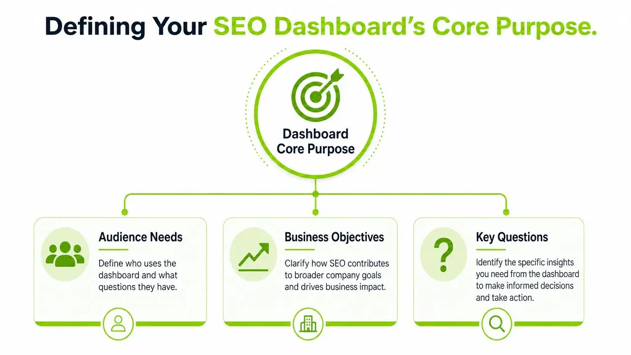
Before you choose a chart, decide who the dashboard is for. Most reporting gets worse the moment one dashboard tries to serve everyone.
Start with the audience
An executive wants a fast answer on business contribution. A marketing manager wants channel performance and trend context. An SEO specialist wants page-level and query-level diagnostics.
Put all three audiences into one screen and the result is usually a mess.
I usually sort dashboard audiences into three practical groups:
| Audience | What they care about | What they don't need first |
|---|---|---|
| Leadership | business outcomes, trend direction, risk | raw query exports |
| Marketing manager | channel contribution, landing pages, conversions | deep technical crawl detail |
| SEO team | ranking shifts, indexation, page diagnostics, AI visibility gaps | simplified scorecards only |
Keep the metric count under control
A common failure is trying to prove value by including everything. That does the opposite. Industry benchmarks show dashboards with more than 10 to 12 active metrics see a 25% drop in executive action rates due to cognitive overload, according to Fugo's dashboard guidance.
That's why purpose comes before metrics. If the dashboard has no job, every metric feels justified.
Use three framing questions
Before building any SEO reporting dashboard, answer these:
-
What decision should this dashboard support?
Examples include budget defense, content prioritization, technical backlog planning, or client retention. -
Who will review it most often?
The daily user and the meeting audience are not always the same person. -
What will they ask after seeing the numbers?
If you can predict the follow-up question, you can design the dashboard to answer it.
A lot of this comes down to understanding stakeholders properly. If you need a sharper framework for that, this guide on audience analysis is useful because it forces you to define who needs what, instead of assuming one report works for everyone.
Translate business goals into reporting logic
Don't start with “we should track impressions.” Start with the commercial goal, then work backward.
For example:
- Revenue growth leads to organic conversions, revenue by landing page, and supporting visibility metrics
- Lead quality leads to high-intent page performance, query themes, and assisted conversion trends
- Market expansion leads to non-brand visibility, geography splits, and localized landing page performance
Practical rule: if a metric can't influence a decision, it probably doesn't belong on the first version of the dashboard.
That alone fixes a surprising amount of reporting.
Choosing the Metrics That Actually Matter
The cleanest dashboards use a metric spine. Not a metric pile.
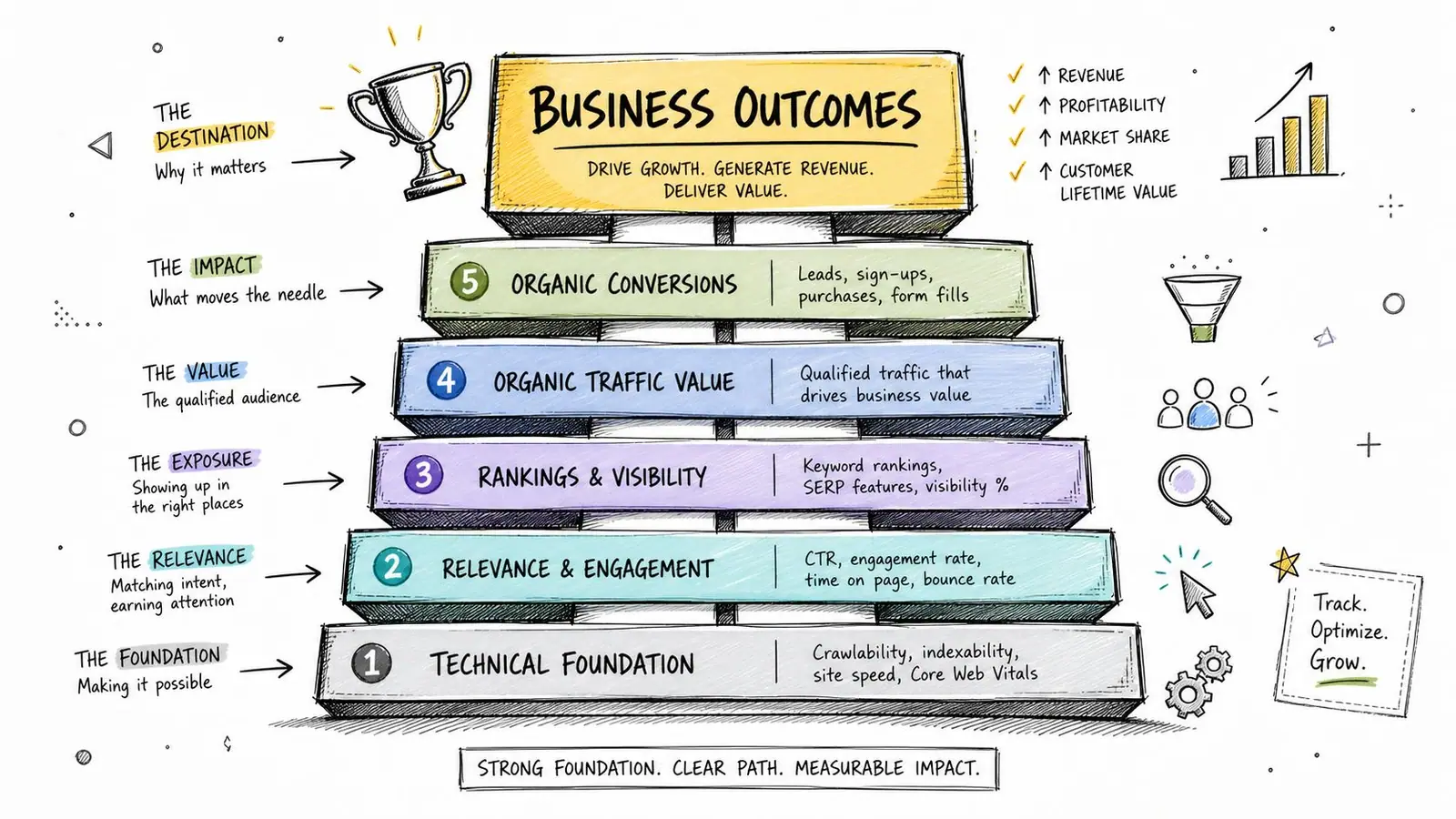
I like to structure the stack in three layers. The top layer is business outcomes. The middle layer is SEO performance. The new layer that many teams still miss is AI visibility.
Business outcomes come first
If your dashboard leads with rankings and hides conversions, it teaches the client to care about the wrong thing.
The first layer should answer questions like:
- Are organic visits turning into leads or revenue?
- Which landing pages produce commercial outcomes?
- Is traffic quality improving or just traffic volume?
Many teams need clearer definitions for key performance indicators for SEO. The useful distinction is simple. A KPI changes behavior and supports a goal. A metric without context just fills space.
Traditional SEO metrics still matter, but they need context
The second layer is the familiar set: impressions, clicks, sessions, rankings, page performance, and backlink signals. These still belong in a modern SEO reporting dashboard. They just can't stand alone anymore.
Use them diagnostically:
- Impressions tell you if visibility is expanding
- Clicks and sessions show whether that visibility becomes visits
- Rankings help explain movement, especially on priority terms
- Backlink and authority signals support off-page context
- Page-level trends reveal where wins and losses are concentrated
If you need a cleaner way to structure page and keyword views, a practical reference is this post on SEO keyword reporting, especially for separating top-level trends from query-level analysis.
Old dashboards asked, “What rank are we in?”
Better dashboards ask, “Did improved visibility create a commercial outcome, and if not, where did the journey break?”
AI visibility is now a required reporting layer
This is the biggest reporting shift.
In 2026, foundational dashboards need to track AI Overview impression counts, referral traffic from AI platforms such as Perplexity.ai and OpenAI.com, and manual citation spot-check scores, according to Index Craft's SEO reporting guide. The same source notes that the CTR for position 1 is 39.8%, while position 2 drops to 18.7% and position 3 to 10.2%, yet AI Overviews can bypass those organic links by answering directly.
That changes how you interpret the usual charts.
A rise in impressions paired with weaker CTR doesn't always mean a title tag problem now. Sometimes it means the query is increasingly covered by AI answers. If the brand is still cited, visibility may be holding. If it's omitted, you have a different problem.
A modern AI visibility layer should include:
- AI Overview impressions
- Referral traffic from AI platforms
- Citation presence on priority queries
- AI share of voice
- Brand mention tracking inside AI answers
Here's a short walkthrough that pairs well with this shift in reporting:
What to remove from the dashboard
The easiest way to improve reporting is often subtraction.
Cut or demote:
- Vanity keyword counts with no page or business context
- Sitewide averages that hide page-level winners and losers
- Duplicate charts showing the same trend in different formats
- Metrics nobody discusses on calls
If a client never asks about a widget and your team never acts on it, remove it.
Connecting and Unifying Your Data Sources
Most dashboard problems start upstream. The visuals are fine. The data model is not.
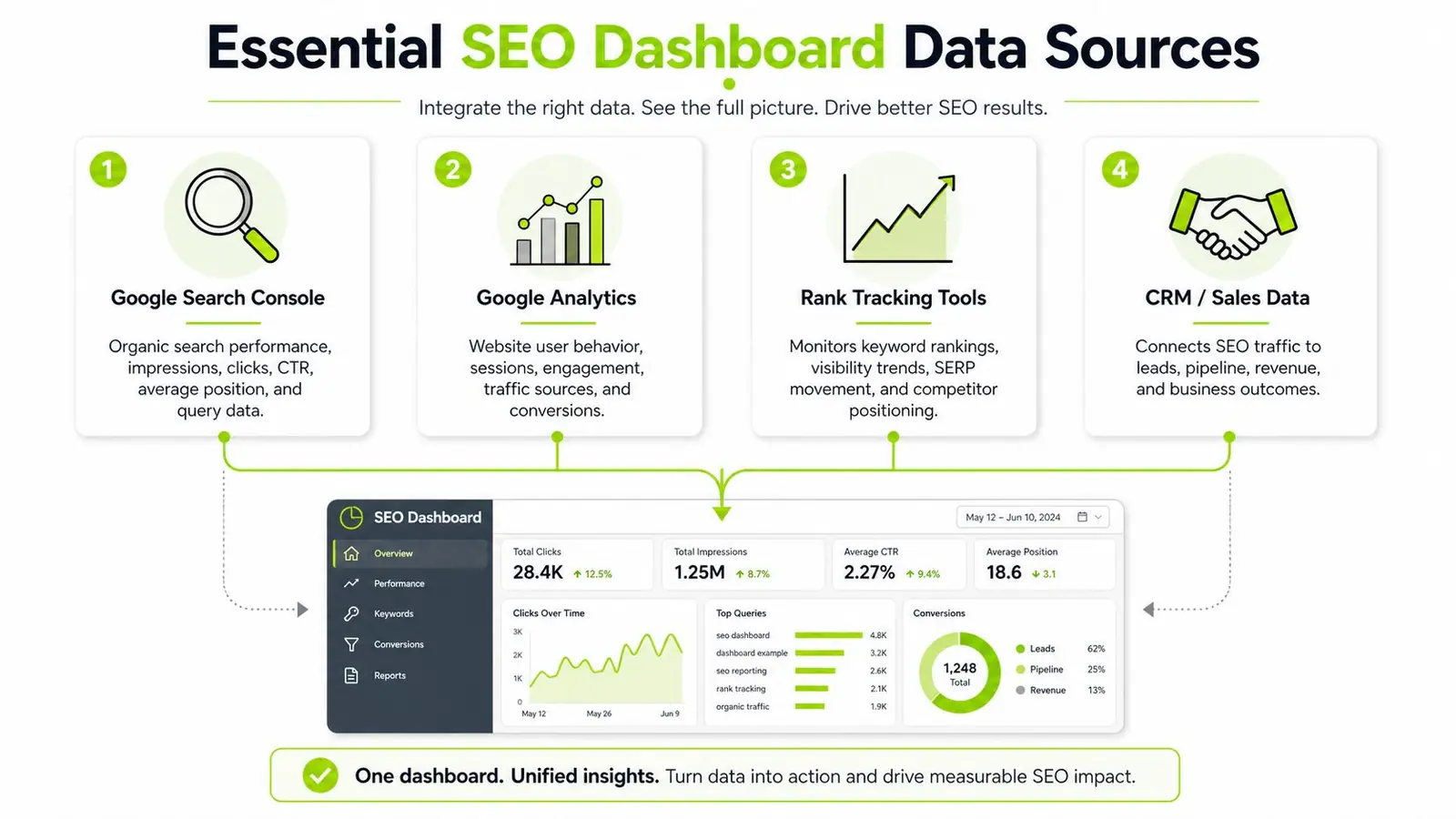
A good SEO reporting dashboard needs a small set of dependable sources working together. Typically, this involves Google Search Console for search visibility, GA4 for behavior and conversions, a rank tracker for position monitoring, and CRM or sales data if you want to tie SEO to pipeline.
The minimum useful stack
You don't need ten tools. You do need the right joins.
The practical baseline looks like this:
- Google Search Console for queries, pages, impressions, and clicks
- GA4 for sessions, events, and conversions
- Rank tracking software for target keyword monitoring
- Backlink data for authority and link acquisition context
- CRM or sales data when the client cares about qualified leads, closed revenue, or opportunity creation
The key is not just collecting each source. It's aligning them so the same landing page or page group can be evaluated across visibility, traffic, and outcome.
Manual aggregation versus unified systems
A lot of agencies still export CSVs, clean them in spreadsheets, and then push them into a report. That works at small scale. It also creates version problems, delays, and inconsistent definitions the moment more than one person touches the workflow.
Here's the trade-off:
| Approach | Strength | Weakness |
|---|---|---|
| Manual exports | flexible for one-off analysis | slow, fragile, hard to scale |
| BI layer with connectors | strong reporting control | setup takes effort |
| Unified platform | less tool switching, faster recurring reporting | depends on connector depth and workflow fit |
Tool sprawl hurts reporting because the story gets split across tabs, exports, and point solutions. For teams trying to reduce that, API-based systems help centralize the flow. If you're evaluating the technical side, this overview of an SEO tool API is a good starting point for understanding how data moves into dashboards and internal reporting systems.
Two integration details that matter more than people think
First, keep naming and segmentation consistent. If one source uses page path, another uses full URL, and a third mixes parameterized URLs, you'll get false mismatches.
Second, separate branded and non-brand performance wherever possible. That prevents dashboards from overstating progress when brand demand is doing the heavy lifting.
A unified reporting setup doesn't just save time. It makes cause-and-effect analysis possible.
Designing Dashboards That Tell a Clear Story
Design is not decoration. In SEO reporting, design is argument structure.
A cluttered dashboard tells the client that everything matters equally. A clear one shows priority. That's why the visual hierarchy matters as much as the metrics themselves.
Use the inverted pyramid
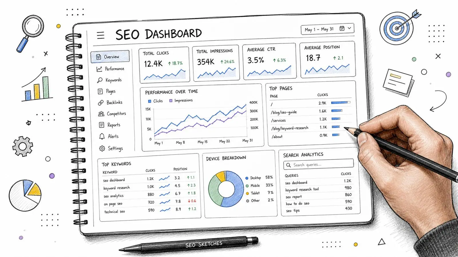
The best structure for client and leadership reporting is the inverted pyramid. The top of the dashboard shows the few metrics that tie directly to business goals. Lower sections hold the evidence and diagnostics.
The standard is clear. Top sections should show 5 to 7 high-level KPIs tied to business goals, while lower sections hold diagnostic data. That structure improves adoption because stakeholders don't get buried in irrelevant detail, according to Siteimprove's guidance on dashboard design.
What goes where
Think in layers, not pages.
At the top:
- business outcome KPIs
- trend indicators
- brief summary of wins, issues, and decisions needed
In the middle:
- landing page performance
- visibility shifts by topic, page group, or geography
- AI citation or AI referral patterns
At the bottom:
- technical diagnostics
- indexation and crawl signals
- deeper query and page tables for investigation
That layout respects how people read reports. Executives scan. Managers compare. Specialists drill down.
Match the chart to the question
A lot of dashboards feel confusing because the chart types fight the message.
Use simple pairings:
- Scorecards for headline KPIs
- Line charts for trend direction
- Tables for page and query diagnosis
- Heatmap-style tables when you need to spot weak geography or device segments
- Bar charts for category comparison, such as page templates or content clusters
Don't use a fancy chart when a plain table answers the question faster.
If a chart needs explanation before the insight is obvious, it's probably the wrong chart.
Add narrative, not just labels
A dashboard without commentary forces the client to do the interpretation work. That's a mistake.
Every reporting view should answer three things in plain language:
- What changed
- What likely caused it
- What the team recommends next
That can be a short written panel above the visuals or notes beside the main charts. Either way, make the dashboard readable without a live presenter.
The strongest client dashboards don't overwhelm people with data literacy tasks. They guide attention. That's what makes them persuasive.
Automating Reports and Client Workflows
Once the dashboard works, stop rebuilding it by hand.
Manual reporting is one of the easiest ways to waste senior SEO time. Pulling exports, formatting slides, checking date ranges, and rewriting recurring commentary every month doesn't improve performance. It just burns hours that should go into analysis and execution.
Automate the data flow first
The first automation layer is straightforward. Connect your data sources so the dashboard refreshes without manual exports.
That usually means:
- scheduling recurring pulls from Search Console, GA4, rank tracking, and backlink sources
- standardizing naming conventions across templates
- setting fixed views for monthly, weekly, and rolling trend windows
When teams go further, they push data into BI tools, sheets, internal systems, or client portals through APIs rather than rebuilding reports each cycle.
For agencies trying to operationalize that process, this article on automated SEO monitoring is useful because it treats monitoring as a workflow, not just a dashboard feature.
Build alerts around exceptions
Good automation doesn't just send scheduled reports. It flags change that needs a response.
Set alerts for things like:
- sudden drops in clicks or sessions on priority pages
- ranking movement on core commercial terms
- technical failures that affect indexing
- loss of AI citation presence on tracked queries
- unexpected changes in branded versus non-brand performance
Those alerts should create tasks, not just notifications. If nobody owns the next step, the alert is noise.
Workflow automation is part of reporting quality
Reporting and operations meet. A dashboard that updates automatically but still requires people to chase context across email, chat, and spreadsheets is only half-built.
That's why teams often benefit from studying broader approaches to digitised workflow implementation. The SEO part is specific, but the operational lesson is universal. Good systems reduce handoffs and make decisions easier to execute.
One practical tool decision
If you want fewer disconnected tools, one option is Surnex, which combines traditional SEO tracking with AI visibility monitoring and offers API access for reporting workflows. That matters if you're trying to track rankings, backlinks, audits, and emerging AI search presence in the same reporting environment rather than stitching those views together manually.
Automation should remove repetitive work. It should not remove judgment. The best reporting systems free up time so the team can explain what the numbers mean and what to do next.
Frequently Asked Questions
How often should an SEO reporting dashboard be reviewed
For most clients, monthly reporting is the right cadence for decision-making. Weekly is useful internally when the team is actively shipping content, technical fixes, or monitoring volatility. Daily reporting usually creates noise unless you're tracking a specific launch, incident, or short-term experiment.
The important part isn't frequency by itself. It's matching cadence to the kind of decisions the team can realistically make.
What tool should I use to build the dashboard
That depends on how complex your setup is.
If you need a low-cost starting point, Looker Studio works well for combining Google data and presenting client-facing views. If you need deeper blending, stronger automation, or AI visibility tracking alongside traditional SEO data, you may need a more specialized stack or a unified platform.
Choose the tool based on the reporting model you want to run, not on how many templates it offers.
How do I report SEO to stakeholders who don't understand SEO
Don't teach SEO first. Start with business outcomes.
Lead with whether organic search contributed to leads, revenue, or another agreed business result. Then explain the performance drivers in simple terms: visibility, traffic quality, conversion performance, and any issues that limited results. Avoid jargon unless it directly changes a decision.
A stakeholder doesn't need to understand canonicalization in detail to approve a fix. They need to understand the cost of leaving the issue unresolved.
The dashboard is a conversation tool. It does not replace the conversation.
How do I explain traffic drops when rankings look stable
Many older dashboards exhibit a critical flaw. They can show ranking stability and still miss why performance fell.
Most dashboards still don't quantify AI visibility loss because they lack a dedicated diagnostic layer. That matters because 50% of queries now trigger AI responses that cite only 3 to 5 brands, according to Nuwtonic's analysis of SEO dashboard reporting. If a brand is omitted from those AI-generated answers, standard ranking metrics may not explain the drop clearly.
So when traffic dips and rankings appear steady, check:
- whether AI answers are appearing more often on target queries
- whether the brand is still cited in those answers
- whether click opportunity is shrinking even while visibility remains
- whether the drop is concentrated on a page type, device, or geography
That's how you turn “SEO is down” into a credible explanation with a plan.
Should the dashboard replace the monthly client presentation
No. It should improve it.
A dashboard is where the evidence lives. The presentation is where you interpret it, answer objections, and agree on next steps. Clients don't just buy access to data. They buy judgment, prioritization, and accountability.
The strongest reporting rhythm is simple: dashboard first, narrative second, action plan last.
If your team needs a cleaner way to report both traditional search performance and emerging AI visibility, Surnex gives agencies and in-house teams one place to monitor rankings, backlinks, audits, and brand presence across AI-driven search experiences. It's built for teams that want reporting to lead to faster decisions, not just better-looking charts.