You open Google Analytics 4 and see sessions. Then Search Console shows clicks and queries that don't line up cleanly. Your rank tracker says one thing, your backlink tool says another, and now someone on your team is asking how often your brand appears in AI Overviews or in ChatGPT-style discovery.
A primary challenge in SEO reporting right now is not a lack of data for many teams. Instead, they lack connection between systems, between metrics, and between search activity and business outcomes.
A useful SEO analytics dashboard fixes that. It becomes the place where rankings, technical health, engagement, conversions, and emerging AI visibility sit in one operating view. Instead of exporting screenshots into a slide deck every month, you can see what changed, why it changed, and what needs attention next.
Why Your SEO Data Is a Mess and How to Fix It
Most SEO teams inherit a stack of tools instead of designing one. GA4 handles behavior. Google Search Console handles visibility. A rank tracker monitors positions. A backlink platform tracks off-page signals. A crawler surfaces technical issues. Then AI monitoring gets bolted on as a separate layer.
The result is predictable. Teams spend more time reconciling dashboards than making decisions.
The mess usually comes from three gaps:
- Metric fragmentation: One tool measures clicks, another measures sessions, another estimates rankings, and none of them share the same logic.
- Workflow fragmentation: SEO managers, content teams, developers, and leadership all look at different reports.
- Channel fragmentation: Traditional search reporting still sits apart from AI-driven discovery, even though users now encounter brands before ever visiting a site.
A unified dashboard solves those gaps by turning scattered reporting into a single decision layer. It doesn't replace every source system. It gives those systems a common language.
That's part of why the category keeps growing. The global SEO reporting tool market was valued at approximately USD 2.1 billion in 2023 and is projected to reach USD 4.8 billion by 2030, according to this market overview on SEO reporting tools. Teams are investing because reporting has moved from nice-to-have to operating infrastructure.
Practical rule: If your team needs five tabs open to answer one performance question, you don't have a dashboard. You have a scavenger hunt.
The fix starts with one decision. Stop treating reporting as a monthly summary and start treating it as search intelligence. That's the mindset behind a stronger search marketing intelligence approach, where data exists to guide action, not just document activity.
Defining the Modern SEO Analytics Dashboard
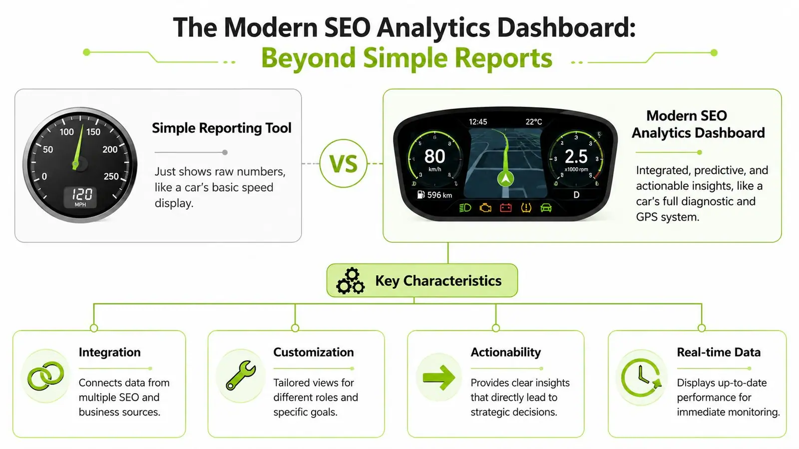
A basic reporting tool is like a car's speedometer. It tells you one thing, in isolation.
A modern SEO analytics dashboard is the full instrument cluster. It shows speed, fuel, engine warnings, route guidance, and system health together. That context changes how you drive. The same applies to SEO.
What a weak dashboard does
A weak dashboard usually dumps raw metrics into charts:
- Traffic without source context: Organic users are shown, but branded and non-branded intent are mixed together.
- Rankings without business context: Keyword movements appear, but no one knows whether those terms matter to leads or revenue.
- Technical issues without prioritization: Crawl errors, Core Web Vitals, and indexation issues pile up with no indication of impact.
This style of dashboard looks busy, but it rarely answers the question that matters most. What should the team do next?
What a modern dashboard does
A modern SEO analytics dashboard acts more like a diagnostic system. It connects cause and effect.
For example, if a template slows down, the dashboard should help you connect that slowdown to engagement changes on affected landing pages. If a cluster of pages gains visibility, the dashboard should show whether those pages also contribute to qualified conversions. If your brand starts surfacing in AI-generated answers, that visibility should appear alongside classic search performance rather than in a separate experiment tab.
The strongest dashboards share a few traits:
| Trait | What it means in practice |
|---|---|
| Integration | Data from SEO, analytics, and business systems sits in one view |
| Customization | Executives, SEO leads, writers, and developers see role-specific views |
| Actionability | Each section of the dashboard points toward a decision |
| Freshness | Teams can trust the dashboard because it reflects current conditions |
A dashboard should reduce interpretation work, not create more of it.
That's why teams often outgrow native product reporting. They need a layer that can combine data sources, normalize definitions, and present the right level of detail for different stakeholders. If you're thinking through that shift, this guide to a data analytics dashboard is a useful companion because the same design principles apply here.
Essential KPIs for a Unified Performance View
You don't need every metric. You need the right groups of metrics.
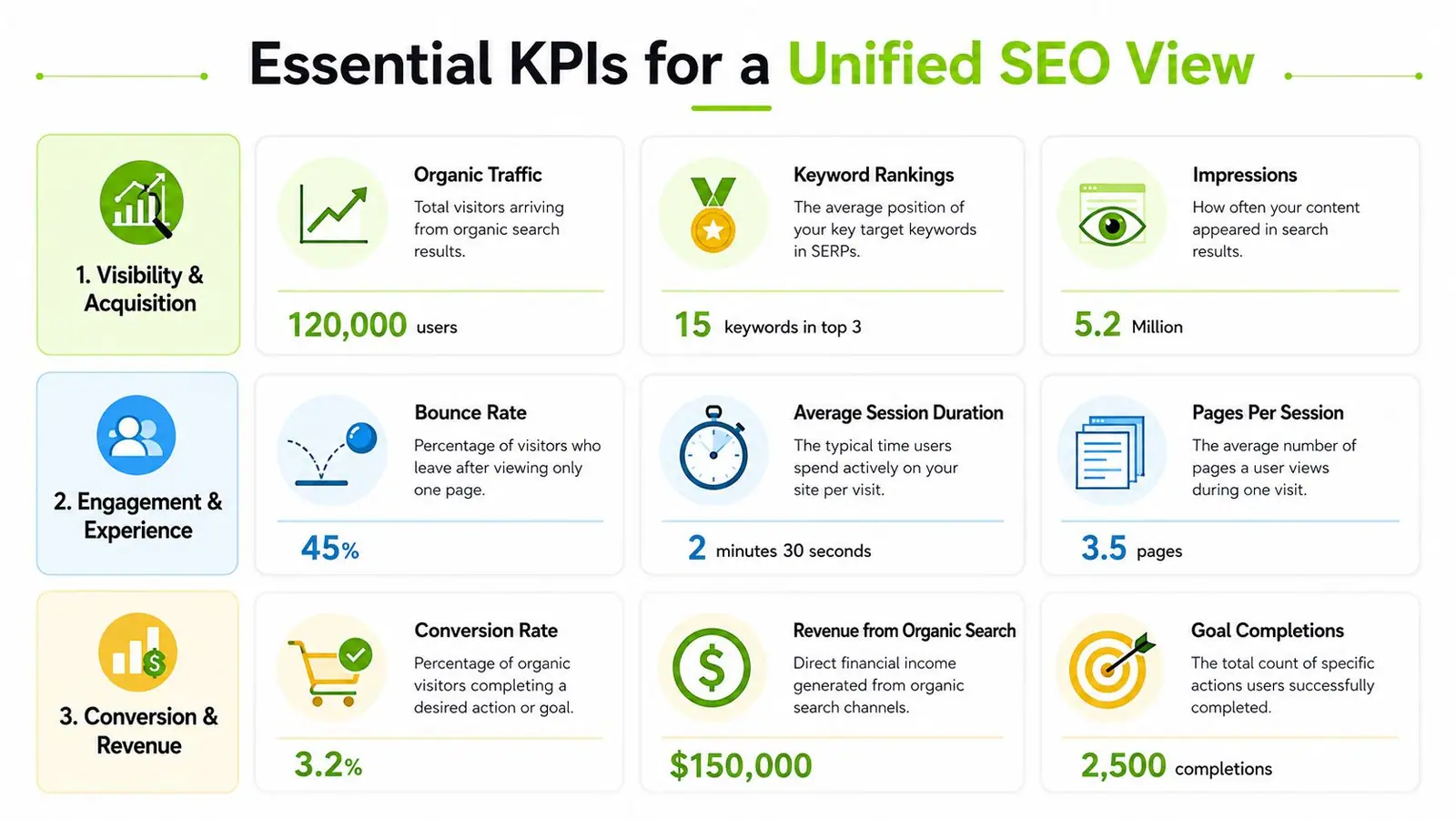
A useful dashboard organizes SEO into a few operating questions. Are people finding you? Are they having a good experience? Are those visits producing business value? And now there's a fourth question many teams still miss. Are people discovering your brand in AI search environments before they ever reach your site?
A simple KPI framework helps.
Traditional search performance
These KPIs answer whether your site is gaining or losing search demand capture.
- Organic traffic: This is still the anchor metric for top-line search performance, but it should be segmented. Branded traffic, non-branded traffic, and landing-page groups tell a more useful story than one aggregate line.
- Keyword rankings: Rankings matter most when they're grouped by commercial importance, page type, or topic cluster. A dashboard full of isolated keyword wins often hides the full picture.
- Click-through rate and impressions: These are visibility signals, especially helpful when rankings improve but traffic doesn't follow. They can reveal whether the page is visible but failing to earn the click.
- Backlink trend monitoring: You don't need a backlink chart for vanity. You need it to spot authority growth, erosion, and opportunities tied to pages that matter.
When link acquisition becomes part of the reporting mix, I prefer showing it next to the pages or categories it supports. That makes off-page work easier to evaluate. If you need a workflow for sourcing outreach opportunities, a link building platform can sit upstream from the dashboard and feed that broader picture.
On-site health and engagement
Search visibility without usable pages doesn't hold for long. This group answers whether technical and UX conditions support performance.
A few metrics do most of the work here:
- Core Web Vitals and page performance: These help you monitor whether important templates stay healthy after releases.
- Crawl and indexation issues: Errors matter less as a giant issue count and more as a prioritized queue by business impact.
- Engagement metrics by landing page: Scroll depth, session quality, and pathing show whether the page fulfills search intent.
- Conversion rate by organic landing page: This closes the loop between acquisition and value.
AI search visibility
Many dashboards still lag in this regard.
SEO teams are currently blind to approximately 75% of the user journey when discovery occurs within AI assistants like ChatGPT before users ever visit a website, as noted in this SEO analytics guide. That means a dashboard built only on site traffic can miss major exposure that happens upstream.
The AI layer should include metrics such as:
- Presence in AI Overviews: Are your pages or brand appearing in overview-style answers?
- Brand citations in LLM-driven discovery: Are AI systems referencing your company, content, or competitors?
- Share of voice in AI answers: Which themes or prompts produce visibility for you versus others?
- Citation gaps: Where are competitors being referenced while your brand is absent?
If your dashboard starts at the click, it misses part of modern search behavior.
For agencies, this is also a reporting challenge. Clients still expect familiar charts, but they also need a view of visibility that extends beyond the SERP click. A clean branded SEO reporting setup helps translate both worlds into one narrative.
Designing Your Dashboard Architecture
The front end of a dashboard gets attention. The back end determines whether anyone trusts it.
A solid build starts by deciding which systems are authoritative for which job. Don't ask one platform to do everything. Ask each source to contribute the piece it measures best, then normalize those pieces into one schema.
Start with the minimum viable data stack
A high-performance setup needs more than analytics and rankings alone. A high-performance SEO dashboard in 2026 mandates aggregating data from at least four distinct sources, GA4, GSC, third-party rank trackers, and CRM systems, using a visualization layer like Looker Studio or a unified platform to enforce a consistent schema and filter for organic traffic across all widgets, according to this guide on building a Google Analytics SEO dashboard.
Those four sources exist for a reason:
| Source | What it should own |
|---|---|
| GA4 | On-site behavior and conversion paths |
| Google Search Console | Search visibility, queries, clicks, and indexing clues |
| Rank tracker or SEO platform | Keyword monitoring, competitive views, backlinks, audits |
| CRM | Validated leads, revenue, and downstream business outcomes |
If CRM data stays outside the dashboard, SEO gets judged on visits instead of business contribution. That's one of the most common reporting failures I see.
Choose your visualization layer carefully
Looker Studio remains a practical choice for many teams because it's flexible and familiar. It works well when you need custom views, blended data, and stakeholder-specific tabs. The trade-off is maintenance. Connectors break, naming conventions drift, and every workaround becomes technical debt.
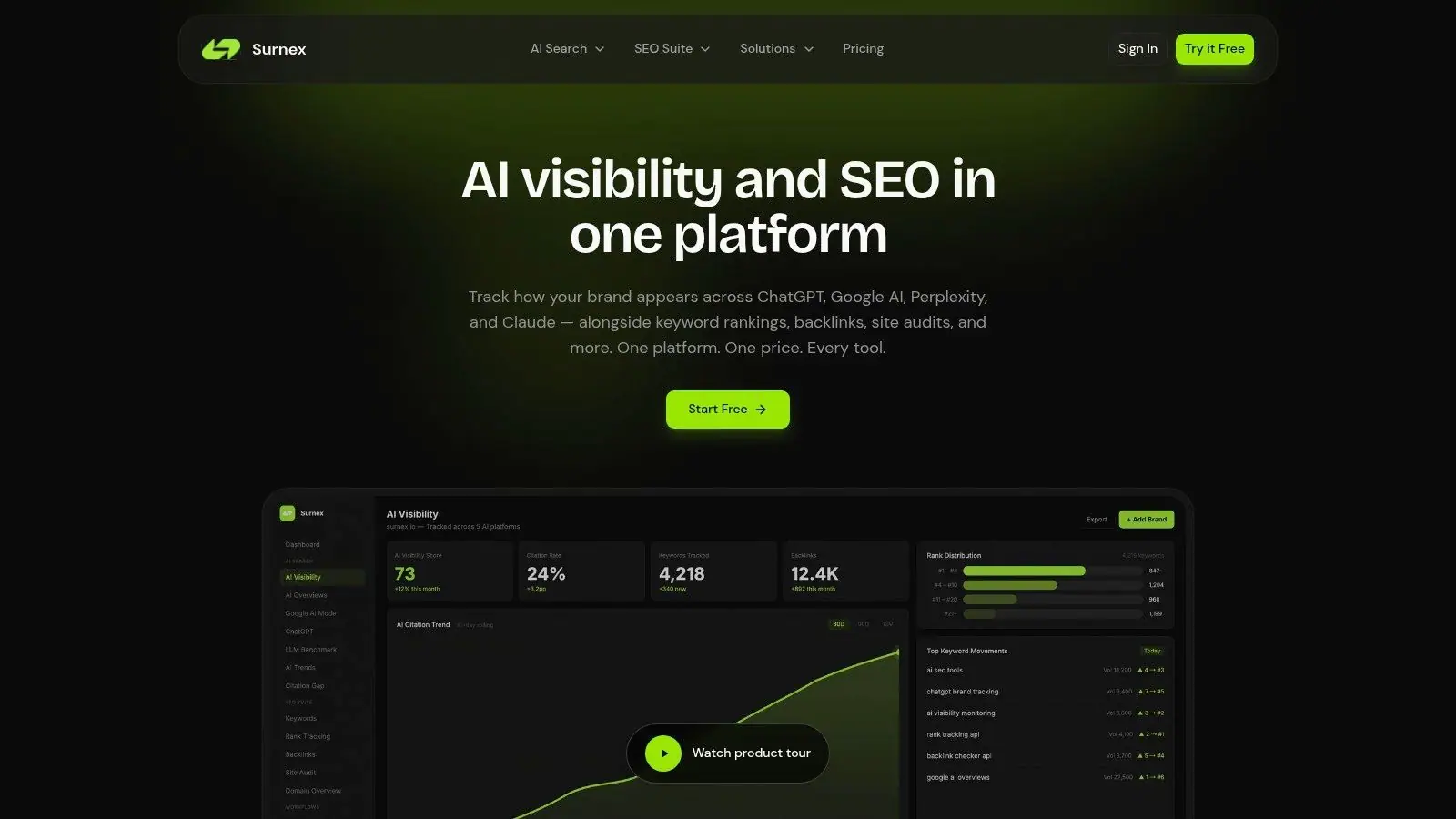
Unified platforms reduce that sprawl when they already combine rank tracking, technical signals, backlinks, and newer AI visibility workflows. In that camp, Surnex is one option that brings traditional SEO metrics together with AI visibility tracking, including monitoring for AI Overviews and brand presence across LLM-style discovery. That matters if your team wants one interface instead of stitching a classic SEO stack to a separate AI monitoring workflow.
Build the schema before building the charts
Many dashboards often fail in this regard. Teams start drawing charts before agreeing on definitions.
Get these rules locked down early:
- Use one organic filter logic: Every relevant widget should isolate organic traffic consistently.
- Standardize page grouping: Blog, product, location, help center, and other templates should be classified once and reused everywhere.
- Align naming conventions: Keyword groups, markets, business units, and conversion events need stable labels.
- Create role-based views: Executives need summary signals. Analysts need drill-downs. Developers need issue views.
Clean taxonomy beats flashy design. If page groups and event names are inconsistent, every chart becomes an argument.
The maintenance side matters too. Scheduled refreshes, documented connectors, and alerting logic keep the dashboard from becoming a stale artifact. Teams that want less manual oversight should also think through automated SEO monitoring early, not after the dashboard is already bloated.
Dashboard Templates for Agencies and In-House Teams
The structure of a dashboard should match the conversation it needs to support. Agencies need to explain value clearly across multiple accounts. In-house teams need to diagnose issues and prioritize work across departments.
Those aren't the same job, so they shouldn't share the same template.
Agency client dashboard
An agency dashboard lives or dies on clarity. Clients don't need every internal metric. They need to understand performance, momentum, and what the agency is doing about it.
A strong agency view usually includes:
- Executive summary panel: Organic trend, top conversions or leads from organic, major wins, major risks.
- Visibility panel: Non-branded rankings, important landing pages, CTR and impression movement, plus AI visibility where relevant.
- Content and page winners: Which pages gained traction, which slipped, and which need optimization.
- Off-page and authority panel: Backlink acquisition trends tied to campaign work.
- Action queue: A short list of priorities for the next reporting period.
This layout supports the right discussion. Not “here are all your metrics,” but “here's what changed, why it matters, and what we're doing next.”
The trade-off is precision versus readability. If an agency tries to show too much diagnostic detail in the client-facing view, the signal disappears. Keep the deeper troubleshooting in a separate internal tab.
In-house technical SEO dashboard
An in-house dashboard needs a different shape because the audience is often cross-functional. SEO, product, engineering, analytics, and content all need to see how their work intersects.
I like a build centered on operational clusters rather than channel summaries:
| Dashboard area | Main use |
|---|---|
| Site health | Crawl issues, indexation patterns, template-level problems |
| Performance by page type | Organic landing pages grouped by template or category |
| Engagement layer | Scroll depth, session quality, key path completion |
| Business outcomes | Leads, assisted conversions, revenue-proximate events |
| Release monitoring | What changed after deployments or content updates |
This template changes the meeting dynamic. Instead of SEO saying “traffic dropped,” the team can inspect whether a release affected page speed, whether that affected engagement, and whether the impact is concentrated in a template or market.
The best internal dashboard doesn't just report a decline. It narrows the search area for the team that has to fix it.
There's also a practical reason to separate these templates. Agencies sell confidence and communication. In-house teams need traceability and prioritization. The same dashboard rarely does both jobs well unless it has distinct views built for each audience.
Common Dashboard Pitfalls and How to Avoid Them
Most dashboard failures aren't technical. They're judgment failures.
Teams add more charts when the dashboard gets unclear. They report rankings because clients expect rankings. They track every issue because the crawler found every issue. None of that guarantees useful reporting.
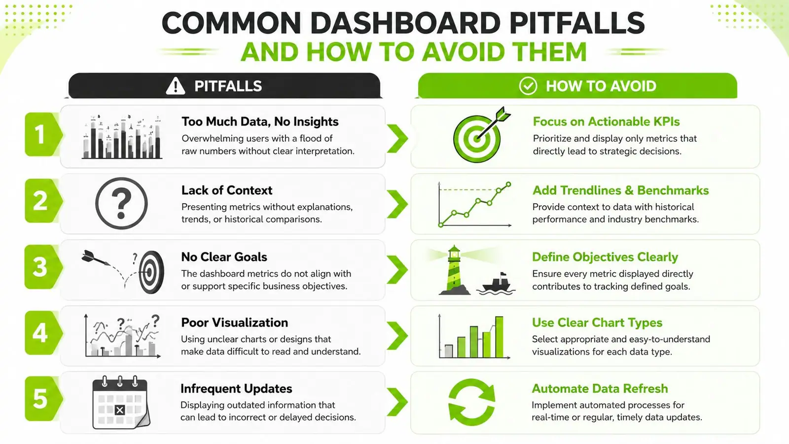
Pitfall one: too many metrics
A crowded dashboard feels packed with information but usually slows decisions. If every panel looks important, nothing is important.
Fix it by limiting each view to the metrics tied to a specific role or question. Executive views need summary signals. Working views need diagnosis.
Pitfall two: vanity rankings
Reporting position changes for irrelevant or low-intent terms creates motion without meaning. Teams celebrate green arrows while conversions sit flat.
Instead, group keywords by business intent, funnel stage, or page type. A smaller set of meaningful keyword clusters beats a giant list every time.
Pitfall three: no segmentation
Blended organic reporting hides what's really happening. Brand demand can mask non-brand weakness. One strong directory can hide underperforming product pages.
Useful segments often include:
- By query intent: Branded versus non-branded
- By page type: Blog, product, category, support, location
- By device or market: Especially when template issues affect only one segment
- By conversion quality: Traffic alone isn't enough
Pitfall four: snapshots with no causality
A dashboard that only shows this week versus last week creates noise. People react to movement without understanding cause.
That's where a stronger framework matters. An expert dashboard must implement a causal analysis framework that links specific technical SEO fixes to user engagement KPIs, establishing a metric spine that maps crawlability directly to revenue-proximate outcomes, according to this guide on connecting technical SEO fixes to engagement and revenue.
In practice, that means the dashboard should help answer questions like:
- Did a template release coincide with a visibility drop?
- Did a speed improvement affect engagement on targeted pages?
- Did an indexation fix improve performance in the affected section only?
Pitfall five: stale data and dead dashboards
A dashboard people stop checking becomes decoration. This happens when refresh schedules fail, ownership is fuzzy, or no one uses the dashboard in live decision-making.
The fix isn't just automation. It's habit. Use the dashboard in weekly reviews, release checks, and prioritization meetings. If the team only opens it before a monthly report, it won't shape action.
Building Your Future-Proof SEO Command Center
A good SEO analytics dashboard doesn't just prove what happened. It helps teams decide what to do next.
That matters more now because search behavior isn't confined to classic blue links anymore. People discover brands through AI-generated summaries, assistant answers, and zero-click experiences long before a site visit shows up in analytics. If your reporting still starts and ends with sessions, you're operating with an incomplete map.
The fix isn't adding another disconnected tool. It's building one unified command center that ties together search visibility, technical health, engagement quality, and business outcomes. That's how teams cut through tool sprawl and stop arguing over whose numbers are right.
For organizations trying to reduce manual reporting and fold AI workflows into marketing operations, an AI automation agency can also be a useful partner model to study, especially when the challenge is operationalizing data rather than collecting more of it.
The teams that adapt fastest will be the ones that treat SEO reporting as live infrastructure. Not a monthly recap. Not a vanity scorecard. A working system for modern search intelligence.
If you're ready to replace fragmented reporting with one clear view of SEO and AI visibility, Surnex is worth exploring. It gives agencies, in-house teams, and developers a single platform for rankings, backlinks, audits, content opportunities, and emerging AI search presence, so you can monitor performance without juggling disconnected tools.