Most advice about dashboards starts in the wrong place. It talks about chart types, color palettes, and layout polish, as if the main job of a dashboard is to look organized.
It isn't.
A useful data analytics dashboard helps someone decide what to do next. If it only displays metrics, it's a report. If it shortens the path from signal to action, it becomes part of the operating system for the business. That distinction matters a lot for SEO teams, paid media managers, and agencies trying to explain fast-moving search changes to clients.
Why Most Dashboards Fail to Deliver
Most dashboards fail because teams build them as status screens instead of decision tools. They become expensive digital wall art. Everyone can see the numbers, but nobody can answer the next question with confidence.
That failure is easy to miss because the market keeps growing. The global data analytics market was valued at USD 69.54 billion in 2024 and is projected to reach USD 302.01 billion by 2030, growing at a 28.7% CAGR from 2025 to 2030, driven by AI and machine learning in enterprise platforms, according to Grand View Research's data analytics market report. More spend doesn't automatically mean more clarity.
A lot of teams already feel this tension. They have dashboards for SEO, paid search, CRM, and web analytics, but they still bounce between tabs, spreadsheets, and Slack threads to explain what changed. If you work across channels, practical resources like PPC campaign optimization strategies are useful because they focus on operational improvement, not just reporting output.
The real failure is design philosophy
The common mistake is treating visibility as the goal. Visibility is only the first step.
A team lead doesn't just need to know that branded clicks dropped, rankings shifted, or conversion volume softened. They need a dashboard that helps them separate noise from cause. That means connecting the KPI to context, then to diagnosis, then to action.
Practical rule: If a dashboard can tell you that something changed but can't help you investigate why, it's unfinished.
This is especially obvious in marketing reporting. Teams often present polished summaries without enough structure for deeper analysis. A cleaner way to think about that problem is through branded SEO reporting workflows, where the output has to serve both executive visibility and analyst investigation.
What working dashboards actually do
The strongest dashboards do three things well:
- Surface priority signals: They make the most important change impossible to miss.
- Support follow-up questions: They let a user move from symptom to cause without leaving the interface.
- Fit the decision cycle: They match how the team reviews work daily, weekly, or in live campaign response.
That's why “more charts” rarely solves anything. Better dashboards reduce friction. They help people decide faster, escalate sooner, and stop wasting time narrating raw metrics that should already be self-explanatory.
Reporting Dashboards Versus Analytics Dashboards
A lot of dashboard frustration comes from one simple confusion. Teams ask a reporting dashboard to do the work of an analytics dashboard.
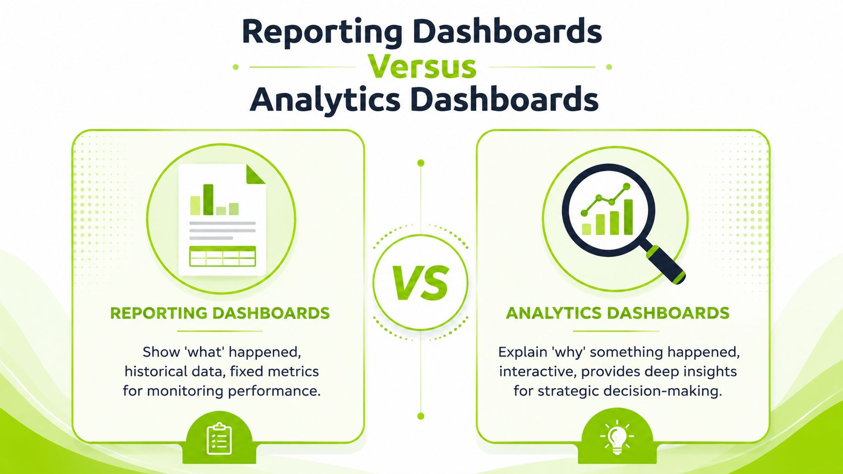
A reporting dashboard answers, “What happened?” It shows fixed KPIs, historical snapshots, and summary trend lines. It's useful for monitoring. Executives, account managers, and clients often need this view because it gives a stable picture of performance.
An analytics dashboard answers, “Why did it happen?” It lets users filter, compare segments, drill into dimensions, and isolate patterns. It's built for investigation. Analysts, SEO strategists, and channel owners need this version because they're trying to explain movement and choose a response.
A simple way to tell the difference
Think of a car.
The dashboard in front of the driver is a reporting dashboard. Speed, fuel, engine temperature. It tells you whether something looks normal.
The mechanic's diagnostic tool is an analytics dashboard. It reads deeper system signals, isolates faults, and helps determine the cause.
Most businesses build the first type and expect the second.
That mismatch creates friction fast. The gap between static reporting dashboards and interactive analytics dashboards is a major source of user frustration, and 68% of first-time designers admit they map UI layouts before understanding user roles and the core questions the dashboard must answer, based on the UX discussion cited in this dashboard design thread.
What each dashboard should be used for
| Dashboard type | Best use | Common failure |
|---|---|---|
| Reporting dashboard | Monitoring KPIs, sharing status, client updates | Stuffing it with too many filters and making it harder to read |
| Analytics dashboard | Root-cause analysis, testing hypotheses, finding opportunity | Making it pretty but too shallow to investigate anything |
The distinction matters in SEO reporting too. A visibility summary is useful, but only if the user can connect it to ranking changes, content shifts, technical issues, or query intent patterns. That's where a structure like keyword rankings and visibility reporting becomes more useful than a static scorecard.
A reporting dashboard should calm or alert. An analytics dashboard should explain.
When teams mix these jobs into one cluttered interface, both users lose. Leaders can't scan the screen quickly, and analysts still have to leave the dashboard to do actual diagnosis.
The Three Essential Layers of a Great Dashboard
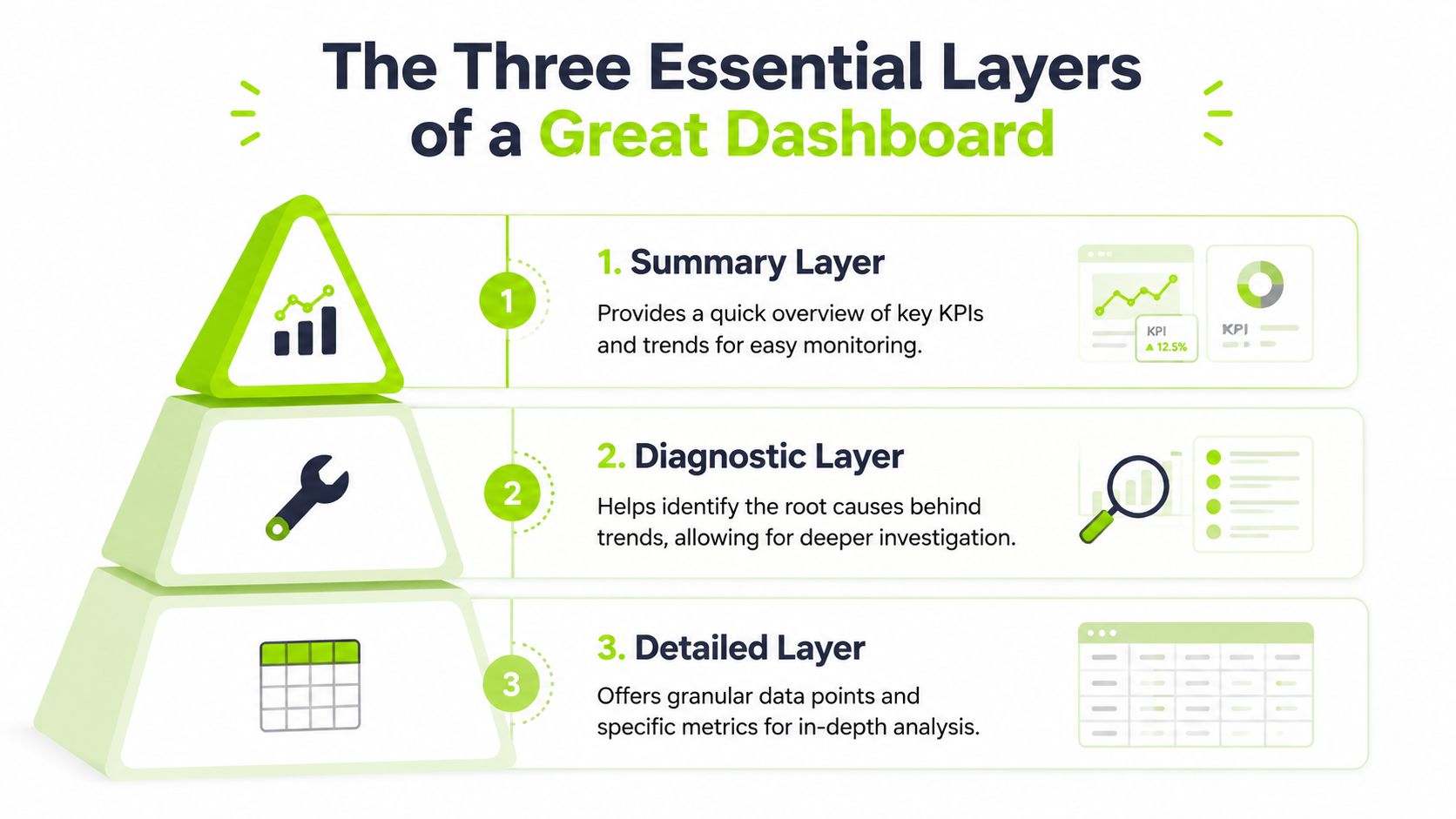
A useful data analytics dashboard needs a clear path from signal to explanation. The cleanest model uses three layers: Summary, Diagnostic, and Detailed.
Without that structure, users hit a wall. They see movement in a headline KPI, but the dashboard doesn't help them trace the cause. That's the data-to-decision latency problem. Effective dashboards must move users from summary KPIs to drill-downs, and that hierarchy matters because 72% of corporate dashboards violate the minimal cognitive load principle by cramming in excessive data, as discussed in NN Group's article on dashboard perception.
Summary layer
This is the top layer. It answers one question first: Is everything OK?
Use this layer for the handful of metrics that define performance right now. In SEO, that might be visibility, top ranking movements, branded presence, technical issue count, and content opportunity status. In paid media, it might be spend pacing, conversion trend, and efficiency signals.
Keep this layer calm. It should not force interpretation.
A short visual explainer helps show how layered dashboards work in practice:
Diagnostic layer
The dashboard demonstrates its value here. It answers: What's changing?
The diagnostic layer compares dimensions and trends. Device splits, location patterns, page groups, query classes, content clusters, backlink shifts, crawl issues, or AI citation movement all belong here. Within this layer, a strategist can test whether the top-line change is broad, isolated, sudden, seasonal, or tied to a specific segment.
Useful diagnostic views usually include:
- Trend comparison: Side-by-side movement across time periods or segments
- Segment isolation: Filters for market, device, page type, content theme, or campaign group
- Context overlays: Notes, release markers, algorithm shifts, or content publish dates
Detailed layer
The bottom layer answers: Why is it happening?
This layer holds row-level detail, query sets, page lists, URL diagnostics, citation references, backlink records, or audit findings. Analysts don't need this visible all the time, but they need immediate access when a summary KPI turns red.
Build the thinking path first. Then build the interface.
For modern teams, this layer often depends on flexible data delivery. If you're feeding dashboard logic into automations, scripts, or internal tools, an SEO tool API workflow becomes part of the dashboard design itself, not a separate technical consideration.
Designing for Decisions Not Decoration
Most dashboard design advice overvalues appearance and undervalues cognition. Clean visuals matter, but not because they look modern. They matter because they reduce the work a user has to do before acting.
Less is usually better
Expert benchmarks recommend showing only 5 to 9 key metrics on a single screen, and placing the most important KPIs in the top-left aligns with user scanning behavior and can lead to 20 to 30% faster decision-making cycles in enterprise environments, according to Yellowfin's dashboard design guidance.
That recommendation sounds restrictive until you've watched a team use a busy dashboard in a live meeting. Once the screen is overloaded, people stop reading patterns and start hunting. The dashboard becomes a puzzle.
What tends to work
The best interfaces support fast recognition.
- Use line charts for change over time: They make trend direction easier to read than decorative visuals.
- Reserve color for meaning: Red, amber, and green should signal condition, not branding preference.
- Keep comparison logic consistent: If one chart uses week-over-week and another uses month-over-month, users will misread the page.
- Write labels like operators will read them: “Non-brand visibility by landing page group” is better than a clever internal title nobody understands.
What usually fails
A lot of common choices look polished and perform badly.
| Design choice | What it does in practice |
|---|---|
| Too many cards at the top | Forces users to scan disconnected numbers without context |
| Complex chart variety | Makes each widget require new interpretation rules |
| Heavy use of decorative color | Hides what actually needs attention |
| Buried filters | Slows analysis and pushes users back to exports |
If a user needs a walkthrough every time they open the dashboard, the design is doing too much.
The most effective dashboard pages are rarely the most impressive-looking ones. They're the ones a strategist can open during a client call, a standup, or a weekly review and immediately answer the next question.
That's also why reporting workflows need to be operational, not just presentable. Teams building client-ready reporting systems usually get better results when the interface is designed for recurring decisions, not for one-time presentations.
Your Dashboard Implementation Blueprint
A strong dashboard front end can't fix a weak backend. If the data model is inconsistent, refresh timing is sloppy, or integrations break, users stop trusting the interface fast.
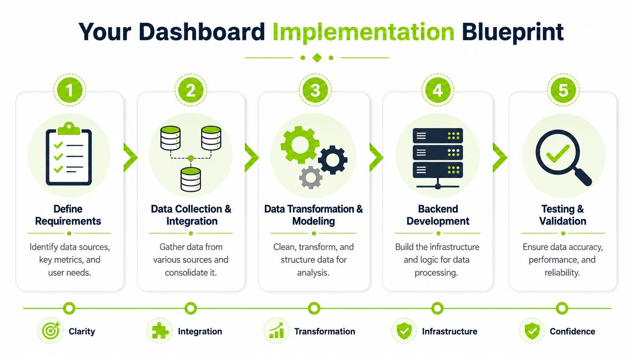
Start with requirements, not connectors
A common initial step involves asking which tools can be connected. Start earlier.
Map the decisions first. Which users need the dashboard? What questions must they answer without exporting data? Which dimensions need filtering? Which metrics need shared definitions? For SEO and search intelligence, this often means combining search console data, ranking systems, backlink sources, site audit outputs, analytics platforms, ad data, and CRM outcomes.
If you need an example of what a custom dashboard build can support at the application level, Unlock business insights with custom solutions is a useful reference point for how firms approach dashboard-backed web apps.
Build the pipeline before the interface
Dashboard reliability comes from the pipeline. Data has to be collected, cleaned, normalized, and modeled before the visual layer ever becomes useful.
A practical implementation usually follows this sequence:
-
Connect source systems Pull data from analytics, search, ad, CRM, and audit platforms.
-
Transform the data Standardize naming, remove duplicate logic, align date handling, and define business rules.
-
Model for the questions you need to answer Don't just mirror source tables. Shape the model around reporting views and diagnostic paths.
-
Set refresh logic intentionally Different metrics don't need the same cadence. Some should update more frequently, others can refresh on a schedule that protects performance.
Protect performance early
Dashboard speed affects usage. Slow pages teach users to stop clicking.
From the verified benchmark data, performance optimization depends on scheduling refreshes during low-traffic periods, reducing complex visualizations per page, and using load-on-demand widgets. Filtering data as it enters the dashboard also reduces overhead, which is why engineering choices matter as much as visual ones.
A few implementation habits pay off:
- Pre-aggregate where possible: Don't compute every view on the fly.
- Limit expensive widgets: Not every chart deserves homepage placement.
- Separate monitoring from exploration: Keep the top page lighter than the investigative layers.
- Design for output and input: Modern teams want dashboards to display data and feed automations.
That last point matters more now because agencies and internal teams increasingly want dashboard data available to workflows, not trapped in a UI. In practice, that means building with APIs, exports, and operational hooks in mind from the start.
Dashboards for Modern Search Intelligence
Search reporting has changed. Ranking charts and backlink summaries still matter, but they no longer tell the full story. Teams now need to understand how brands appear across traditional search, AI-generated search features, and LLM-driven discovery environments.
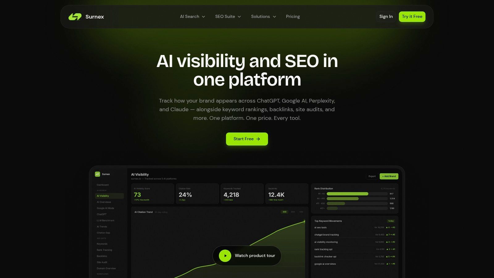
A modern search dashboard has to answer a broader set of questions. Did visibility drop in classic rankings, or did the click pattern change because AI Overviews absorbed attention? Is a brand appearing in model-driven answers but without strong citation consistency? Are content opportunities visible in one layer of search but absent in another?
What a useful search dashboard should combine
For SEO agencies and in-house teams, the strongest setup usually brings several views into one operating surface:
- Core SEO metrics: Rankings, backlinks, audits, and content opportunities
- AI visibility signals: Appearance in AI Overviews and other AI-driven search experiences
- Brand presence tracking: Monitoring how often a brand is surfaced within LLM discovery paths
- Time-based change analysis: Trend lines that help separate one-off spikes from sustained movement
The practical value comes from unification. If rankings are down, technical issues are flat, backlinks are stable, and AI visibility has shifted, the narrative changes. The team no longer has to guess which tab might contain the explanation.
Where teams get stuck
Many agencies still report search through disconnected tools. One platform tracks rankings, another runs audits, a third handles backlinks, and AI visibility lives in manual notes or ad hoc exports. That setup creates lag. It also makes client communication harder because the story has to be assembled after the fact.
This is one place where a platform like Surnex fits naturally in the workflow. It combines AI visibility tracking with rankings, backlinks, audits, and content opportunities in one dashboard and also provides an API for teams building automations or integrations. That matters when search intelligence has to support both reporting and diagnosis.
Search teams don't need more screenshots. They need one place that connects movement, cause, and opportunity.
A practical example
An agency notices that a client's branded demand looks stable, but organic traffic patterns soften. A reporting dashboard would show the decline. An analytics dashboard for modern search would help the team inspect ranking changes, page-level performance, technical disruptions, and AI surface presence together.
That changes the meeting. Instead of saying, “Traffic is down and we're investigating,” the agency can say, “Traditional ranking movement was limited. The bigger shift is visibility distribution across newer search experiences, and here's where citation gaps are opening.” That's a much better use of a data analytics dashboard.
How to Avoid Common Dashboard Pitfalls
A dashboard project usually fails for ordinary reasons, not dramatic ones. The data is messy. Users aren't trained. The interface looks polished but feels awkward. Nobody owns the metric definitions. Adoption drops unnoticed.
The adoption problem is real. Despite strong market growth, BI and analytics tool adoption remains stuck at around 20% to 25% of employees, with key barriers including lack of proper training at 50%, insufficient data quality at 41%, and ease-of-use challenges at 33%, according to BARC's infographic on BI and analytics adoption.
The fixes are usually operational
You don't solve low adoption by adding more widgets. You solve it by tightening the system around the dashboard.
- Assign metric ownership: Someone needs to define each KPI and maintain the logic behind it.
- Train by role: Executives need scan-and-decide training. Analysts need filter-and-diagnose training.
- Start with a narrow use case: A dashboard tied to one recurring decision gets used more than a giant all-in-one launch.
- Review data quality upstream: If source systems conflict, the dashboard will inherit the confusion.
Watch for hidden mismatch
Some dashboards fail because the audience and design are mismatched. A client-facing report gets loaded with analyst controls. An internal analytics view gets simplified until it can't explain anything. A leadership scorecard becomes the only dashboard, even though operators need drill-down capability.
Even external research workflows can expose this issue. If a team is using something like a government RFP database to identify new opportunities, the useful dashboard isn't the one that merely lists opportunities. It's the one that helps the team compare fit, urgency, source quality, and follow-up actions inside a workflow.
Dashboards get used when they remove work, not when they add another screen to check.
If you treat the dashboard as a product instead of a one-time deliverable, the quality goes up fast. It gets clearer, faster, and easier to trust. That's when a data analytics dashboard starts doing its real job.
If you need a clearer view of how brands appear across traditional search and AI-driven discovery, Surnex gives agencies, in-house teams, and developers a single place to track AI visibility alongside rankings, backlinks, audits, and content opportunities.