The recommended Google Business Profile cover photo size is 1024 × 576 pixels at a 16:9 aspect ratio. Keep the file in JPG or PNG format and aim for a size between 10 KB and 5 MB.
You've picked a solid photo, uploaded it, and then Google trims the exact part you wanted to show. That's the normal failure mode with a google my business cover photo size question, because the upload spec is only half the job. The other half is composition, especially when the same image is shown differently across surfaces.
If you want the broader profile context first, discover what a Google Business Profile is before you fine-tune the cover asset. For teams working through local visibility, the photo also sits inside a wider listing strategy, so it helps to think about the profile as part of the workflow described in local business search fundamentals.
Your Guide to the Perfect GBP Cover Photo
A cover photo fails most often when the subject is pushed too far toward the edge. The file can meet the upload requirements and still look awkward once Google trims the frame on different surfaces.
Use the image the way a junior designer should use a hero banner, with a clear safe zone around the center. Keep the main subject, signage, faces, and product details close enough to the middle that the photo still reads cleanly after Google crops it. That matters more than forcing every visual element into view.
Practical rule: If a key detail cannot survive a center crop, it does not belong in the cover photo.
The safest composition starts with 1024 × 576 pixels in a 16:9 frame. That gives you the right file shape, but shape alone does not solve the problem. Google can show the same image with slightly different framing across devices and profile surfaces, so the essential job is to build in margin where cropping is most likely to happen.
Use that margin with intent. Leave breathing room around the edges, keep text off the corners, and avoid placing important objects so close to the border that a tighter crop cuts them off. If you want the broader profile context first, discover what a Google Business Profile is before you fine-tune the cover asset.
For teams working through local visibility, the cover photo sits inside a wider listing strategy, so it helps to think about the profile as part of the workflow described in local business search fundamentals.
Google Business Profile Cover Photo Spec Sheet
A cover photo that looks fine in the upload dialog can still fail on the live profile if the composition is too tight. That is why the working spec sheet should start with the file shape, then move to the safe zone around the center, because Google does not keep the same crop visible on every surface.
| Attribute | Recommendation |
|---|---|
| Aspect ratio | 16:9 |
| Recommended dimensions | 1024 × 576 pixels |
| Acceptable file types | JPG or PNG |
| Typical file size range | 10 KB to 5 MB |
| Practical display note | Google may crop differently, so keep the subject centered |
The practical default is a 16:9 frame at 1024 × 576 pixels, with JPG or PNG files usually fitting the job. Independent size guides point to a range of accepted uploads, which is why the spec sheet should be treated as a safe working baseline rather than a rigid creative rule (postfa.st).
The file type matters less than the layout, but it still affects the workflow. PNG is useful when the image has clean edges or text, while JPG is usually the better choice for photos with more detail and lighter file weight. Keep the file within a sensible size range, then check the image at full width and in a tighter crop before approval.
Google Business Profile image guidance has settled into a more consistent 16:9 pattern for cover photos, even though other profile images follow different conventions (imexpert.au). That consistency helps production teams, but it does not remove the need to leave room around the center of the frame.
Use this sheet as the upload checklist, not the creative brief. A file can meet every technical requirement and still look awkward if the subject sits too close to the edge or if the design depends on corner-to-corner visibility.
Why Aspect Ratio Is More Important Than Pixels
A cover photo is a shape first and a file second. Get the shape wrong, and even a sharp image can feel cramped, stretched, or cropped in the wrong place. Get the shape right, and you have a much better chance of keeping the important part visible across surfaces.
The 16:9 aspect ratio is the part to protect because it keeps the composition predictable. Pixel counts can shift, but the ratio has to stay intact if you want the image to hold together in Google's display. That matters more than chasing a single exact size, because the same file can still be cropped differently depending on where it appears.
Why the ratio survives better than the exact size
Independent guides show a spread of accepted dimensions, which points to Google accepting a range of aspect-ratio-consistent files rather than one fixed pixel box. That is useful in production, but it does not mean any 16:9 image will work well in practice. The platform may accept the upload while still trimming the frame in a way that weakens the composition.
A critical aspect is placement. If the subject sits too far left, too high, or too close to the edge, the important part can disappear when the image is displayed on a tighter surface. I treat the center of the frame as the safe zone, and I review that crop before anyone signs off on the asset. For teams that also manage local landing pages, the same habit helps with mobile-first design checks, because the visible area often changes once the layout shrinks.
A cover image can meet the technical spec and still fail visually. The upload is only the starting point, the composition is what keeps the photo usable. Put the priority on the frame, then use the pixels to support it.
How Google Crops Your Photo on Different Devices
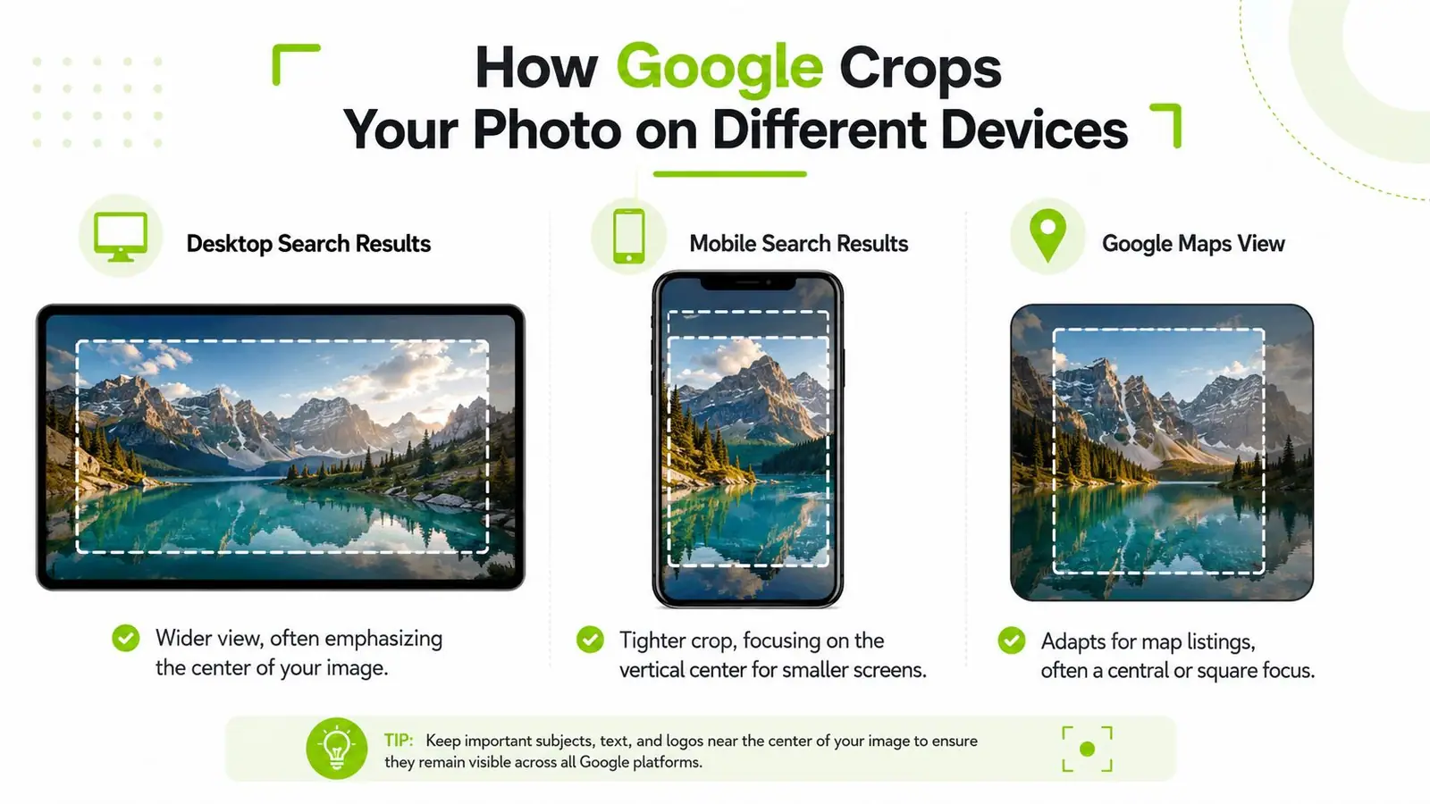
Google's own help center frames cover photos as something you manage through the profile photo tools, and the public guidance shows that the display can vary by surface rather than lock into one exact rendering (Google Business Profile Help). That's the core issue with google my business cover photo size, because the upload can be correct while the visible result still shifts.
Build around the safe zone
The best response is a central safe zone. Put the main subject, logo, storefront sign, or signature product in the center area of the photo, and leave the edges as expendable space. That way, if Google trims the top, bottom, or sides on a smaller surface, the image still reads cleanly.
For most brands, the safe zone is less about a technical grid and more about discipline. Don't place the only readable text at the far edge. Don't put a person's face against the extreme left if the right side is empty. Don't assume the crop will preserve the exact framing you saw in your editor.
If you manage multiple locations, this matters even more. A cover image that works for one storefront can fail on another if the sign placement is different. For broader mobile presentation patterns, the same framing logic applies to mobile site SEO, because the smallest screen usually reveals the weakest crop decision fastest.
What to protect inside the frame
Keep these elements inside the center-most portion of the image:
- Primary subject: the thing you want the customer to notice first.
- Brand identifier: signage, logo, or a unique product detail.
- Human faces: if they're part of the story, keep them comfortably away from the edges.
- Text overlays: avoid relying on them unless they remain readable after trimming.
The key point is that the “correct size” isn't the same as the “best visible result.” That distinction is what most spec pages miss, and it's the difference between a photo that merely uploads and one that achieves its purpose.
Optimizing Your Image File Before Uploading
A cover image can have the right dimensions and still perform badly if the file is too heavy or the compression is sloppy. The practical goal is simple. Keep it light enough to load quickly, and keep enough detail so the photo still looks deliberate on desktop and mobile.
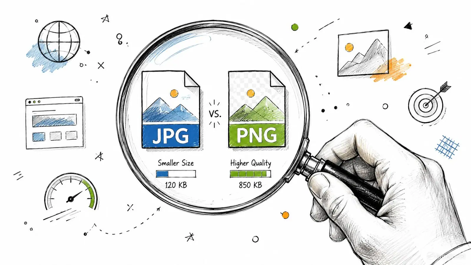
Use JPG for most photographic cover images. It handles storefronts, interiors, team shots, and product scenes efficiently because those images usually contain a lot of color and texture. Use PNG when the image relies on sharper edges, logos, or other graphic elements that need cleaner rendering. The trade-off is file weight, since PNG can preserve crisp detail while producing a larger file than you need.
JPG or PNG for a GBP cover photo
The file format should match the content, not just the brand preference. A clean photo usually compresses better as JPG, which helps preserve speed without making the image feel muddy. A graphic-heavy cover, especially one with crisp branding or text-like shapes, often looks cleaner as PNG.
The decision usually comes down to what matters more in the final crop, lighter delivery or sharper edges. If the image is mostly photography, JPG is usually the practical default. If the image depends on exact edge clarity, PNG is safer, as long as the file does not get unnecessarily large.
Keep quality high without overloading the file
Compression should remove waste, not visible detail. Export the image so it still looks balanced, bright, and readable after Google processes it, then compare the result on a phone and a desktop screen. If the cover starts to look soft, re-export from a better source file and compress again with less pressure.
For practical compression workflows, strategies for faster loading images is a useful resource when you want to cut file weight without flattening the image. That matters because a listing feels more polished when the cover loads quickly instead of hanging while the page settles.
If you are labeling assets or building a broader image workflow for the site, use the same care with supporting image metadata. alt text best practices is a useful reference for the rest of the image set, even though the cover photo itself is judged visually first.
Good optimization stays out of the way. The user just sees a cover image that opens quickly and still looks intentional.
How to Upload or Change Your Cover Photo
- Sign in to the Google account that manages the Business Profile.
- Open the business listing you want to edit if you manage more than one location.
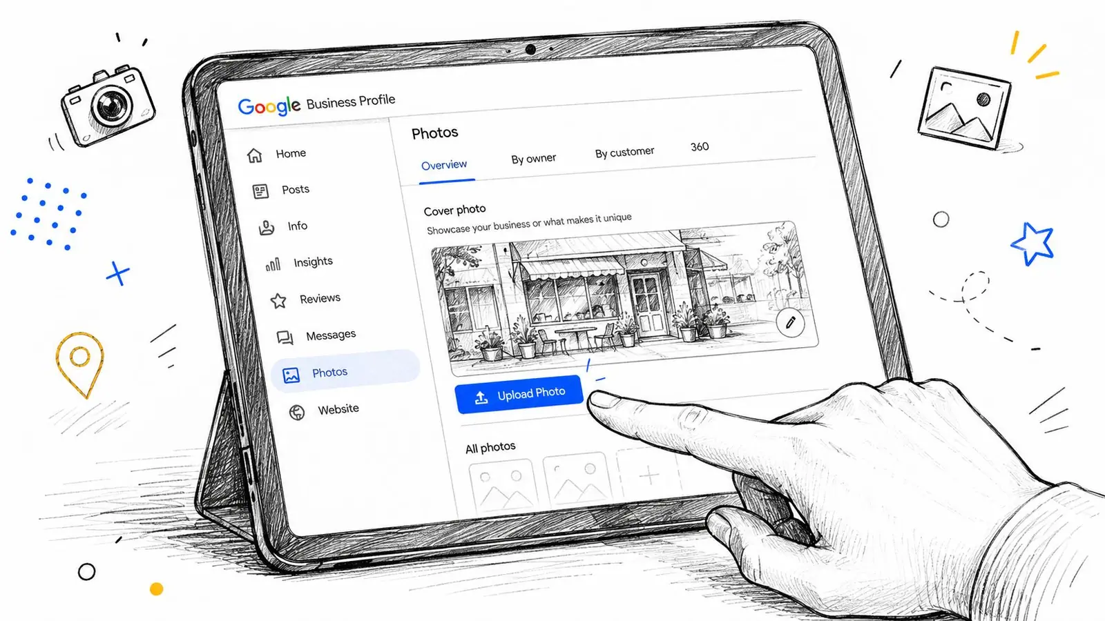
- Go to the photo section and choose the option for adding a photo.
- Select the cover photo category instead of uploading it as a general image.
- Choose the prepared file from your device and upload it.
- Check the result on desktop and mobile after the upload finishes.
The interface changes over time, but the workflow stays the same. The goal is to get the image into the correct category, then verify that the crop still protects the subject.
After the upload, pause before moving on. If the crop trims too tightly, replace the image rather than hoping Google will adjust it later.
Here's a short walkthrough video that shows the upload flow in context.
Troubleshooting Common Cover Photo Issues
A cover photo usually fails for one of three reasons. The upload is rejected, the image quality breaks down after cropping, or Google shows a different photo than the one you selected. Each problem needs a different fix, so treat them separately.
The image doesn't show up
If the photo never appears, start with the file itself. Check the format, confirm the file is cleanly exported, and make sure the image fits the business profile use case. Off-spec files, broken exports, or images that are too heavy for a smooth upload are the first things to rule out.
If the upload goes through but the listing still looks unchanged, compare the live profile with a cached view. A stale preview can make it look like nothing happened even when the new image is already in place, so a check against cached Google results can save you from chasing the wrong problem.
The photo looks blurry
Blurry output usually starts with the source file. The image may already be soft, too compressed, or too small for Google to crop without losing clarity. Re-export from the original asset instead of saving over an already compressed copy, because each extra save tends to make the result worse.
Crop pressure can also create the blur effect. If the subject was framed too tightly before upload, Google may have very little room to work with, and the final display can look soft or awkward once the platform adjusts it for the cover slot.
Google picks a different image
Google does not always keep the selected cover photo as the final visible image. If another photo shows up instead, the usual issue is that the chosen image does not read well in Google's system, or the crop leaves too much happening at the edges. Replace it with a cleaner image that keeps the main subject centered and easy to recognize in a narrow safe zone.
If the old image still appears in search results, the problem may be cached display rather than the live profile itself. Check the result in a fresh view before you assume the upload failed.
Frequently Asked Questions
Can I use a vertical photo as my cover photo?
You can upload many image types, but a vertical frame is a poor fit for a cover asset because the display is built around a 16:9 layout. The safer move is to crop the image into a wide composition before upload and keep the main subject near the center so the crop has room to breathe on different screens.
How long does it take for a new cover photo to appear?
It usually shows quickly in the profile, but the visible result can vary by surface and device. If the new image doesn't appear where you expect, check both the live profile and any cached views before assuming the upload failed. A preview can lag behind the actual listing, especially when Google is still serving an older version.
Why is Google showing a customer photo instead of my cover photo?
That happens when Google surfaces another image because it seems more relevant or more visually usable. The fix is to upload a stronger branded image with a clear center subject and fewer edge-dependent elements. In practice, images with a clean safe zone hold up better when Google shifts the crop.
Should I keep text on the cover image?
Only if the text remains readable after cropping. If the message depends on tiny type or edge placement, put that information somewhere else in your profile or on the landing page instead. Cover photos work best when the image carries the brand and the text does not need to survive every crop variation.
What's the safest file format to start with?
For a photo-heavy cover image, JPG is usually the most practical starting point. Use PNG when crisp graphic edges matter more than file efficiency. The format matters less than giving Google a clean source file that still looks good after it trims the frame.