Is your alt text still treated like a compliance checkbox, or are you using it as a strategic asset?
For years, alt text was often written late in the publishing process, if it was written at all. That old workflow no longer holds up. Alt text now sits at the intersection of accessibility, image search, topical relevance, and AI-driven discovery. If a screen reader user can't understand your image, search engines and large language models often struggle too. If your alt text is vague, stuffed, or missing, your images become harder to interpret, cite, and trust.
That matters because accessibility failures are still widespread. Moz reports that 97.4% of homepages globally contain accessibility errors, and missing alt text accounts for 61% of those failures. Legal exposure isn't abstract either. The same Moz resource notes that 2021 data showed roughly 10 lawsuits filed per day related to digital accessibility violations. For agencies and in-house teams, that's reason enough to tighten process.
There's also a newer layer. AI systems increasingly summarize pages, interpret visuals through surrounding context, and surface content in answer-style experiences. Well-written alt text helps those systems understand what an image contributes to the page. That's useful for accessibility, useful for SEO, and useful for AI visibility.
If your team works with visual identity, person-based images, or verification-related content, PeopleFinder for identity verification is a useful example of how image understanding is becoming part of broader search and discovery workflows.
1. Be Descriptive and Specific
Generic alt text fails fast. If an image says “chart,” “team,” or “dashboard,” a screen reader user learns almost nothing. Search systems and AI systems don't get enough context either.
Write alt text the way you'd explain the image to someone over the phone. Focus on the information the image adds to the page, not every visible detail. If the image supports a blog post about reporting, describe the report. If it supports a service page about AI visibility, describe what's being measured and why it matters.
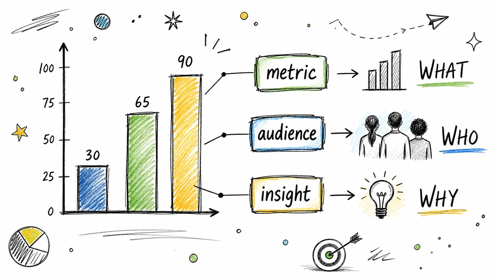
What specific looks like
A weak version might say: “graph.”
A stronger version says: “Bar chart comparing quarterly branded search visibility across client accounts.”
That second version gives a user the image type, subject, and purpose. It also helps AI systems connect the image to the surrounding topic. This is the same principle that improves page clarity when you write SEO content with clear topical alignment.
Practical rule: If the image disappeared, the alt text should preserve the reason it was there.
Specific doesn't mean bloated. Don't list every color, icon, and pixel-level element unless those details matter. On a product page, material, variant, and distinguishing feature usually matter. On a B2B service page, the core insight usually matters more than design details.
A few working patterns:
- For photos: Describe the subject and relevant action. Example: “SEO team reviewing analytics dashboard during quarterly planning.”
- For screenshots: Describe the interface function and highlighted element. Example: “Surnex dashboard showing AI visibility tracking across major LLMs.”
- For charts: Describe the chart type plus main takeaway. Example: “Line chart showing month-over-month growth in branded AI visibility.”
When teams struggle with this, I usually see one root problem. They write alt text from the media library without reading the page. The fix is simple. Open the page, read the nearby copy, then describe the image in a way that supports that exact context.
2. Keep It Concise (Under 125 Characters)
Good alt text is short enough to be usable and complete enough to be meaningful. That balance is harder than it looks.
Best practice is to keep alt text at 125 characters or less because screen readers may truncate longer descriptions. In practice, that limit forces discipline. You have to lead with the most important information instead of dumping every visible detail into the field.
How to edit for clarity
Start with the full idea. Then cut everything that doesn't help a user understand the image's role.
For example:
- Too long: “Dashboard screenshot showing Surnex AI visibility tracking interface with rankings, filters, and competitor comparison widgets”
- Better: “Surnex dashboard tracking AI visibility and competitor benchmarks.”
The shorter version is easier to hear, easier to scan in code review, and more likely to preserve the core meaning if assistive tech or downstream systems prioritize the beginning of the string.
Another practical detail matters here. Level Access also recommends ending alt text with a period so screen readers add a pause before moving on. That's small, but it improves flow.
End the thought cleanly. A period helps the description sound finished instead of bleeding into the next element.
Teams that publish at scale should make this operational, not aspirational. Add a character-count field to your CMS workflow. Review long alt text during QA. If writers consistently go over the limit, train them to write the most useful phrase first and trim the rest.
A fast editing method works well:
- Lead with the subject: Put the core noun first, such as “Bar chart,” “Surnex dashboard,” or “Blue trail running shoe.”
- Keep the purpose: Add the one detail that explains why the image matters on this page.
- Cut filler words: Articles and extra adjectives often aren't necessary.
Concise alt text respects the user's time. That's true for accessibility, and it's just as true when search systems try to interpret page elements quickly.
3. Avoid Redundancy and “Image Of” Phrases
Most bad alt text isn't malicious. It's lazy formatting that no one corrected.
The classic example is starting with “image of,” “picture of,” or “screenshot of.” Those phrases waste characters and add no meaning. Screen readers already identify the element as an image, so you're spending your limited space repeating what the user already knows.
What to remove immediately
Bad: “Image of a team analyzing reports”
Better: “In-house SEO team reviewing quarterly performance reports.”
Bad: “Screenshot of Surnex dashboard showing AI Overview rankings”
Better: “Surnex dashboard displaying brand visibility in AI search results.”
This is one of the easiest wins in an audit because the fix is mechanical. You can spot it in bulk, update your style guide, and remove it from future workflows.
Use this cleanup process:
- Flag repeated starters: Search your CMS export for “image of,” “picture of,” and “screenshot of.”
- Rewrite from the noun outward: Start with the subject or function instead.
- Save room for meaning: Use those recovered characters for the part that helps the user.
There's a second kind of redundancy that teams miss. Don't repeat nearby copy if the image adds nothing new. If a decorative icon sits next to a text label that already says “Download report,” the icon usually shouldn't have descriptive alt text at all.
That leads to the broader rule. Redundant images shouldn't force extra audio on screen reader users. If the image doesn't contribute new information, skip the duplication and keep the experience clean.
4. Optimize for SEO and AI Discoverability Without Stuffing
Alt text can support relevance, but only when it reads like normal language. Once teams realize alt text may influence search understanding, some of them overcorrect and start stuffing keywords into every image field. That hurts accessibility first, and it usually makes the page look low quality to everyone else too.
Natural language wins. If your page targets AI visibility tracking, and the image depicts an AI visibility dashboard, use that phrase naturally. Don't jam in every adjacent keyword variation.
What works and what doesn't
Natural: “SaaS dashboard displaying AI visibility rankings and backlink trends.”
Stuffed: “SEO dashboard AI visibility platform rank tracker backlink checker enterprise analytics software.”
The first helps a user and gives machines clear context. The second sounds like a broken tag cloud.
This guide to SEO for AI search is a useful companion mindset. The goal isn't to write for robots. The goal is to make content so explicit that both people and machines understand it the same way.
If you want a quick workflow aid, tools that optimize image alternative text can help generate drafts. But draft is the key word. Final approval should stay with a human who understands the page, the audience, and the image's role.
Field note: Alt text should answer one question clearly. What does this image contribute to this page?
That question matters even more for AI discovery. LLMs often work by connecting page sections, labels, surrounding text, and image context. When your alt text is specific and topical, it becomes easier for those systems to associate the image with the page's core subject. That can improve how your content is interpreted in answer-style search experiences.
A simple operating standard works well:
- Use one relevant phrase if it fits naturally: Not a list.
- Match the page topic: Product page alt text should sound different from blog post alt text.
- Avoid invented precision: If the image doesn't prove a result, don't write alt text as if it does.
Treat alt text like supporting copy, not a keyword dumpster.
5. Consider Context and Page Purpose
The same image can need different alt text on different pages. Teams often miss this because they write alt text once in the asset library and reuse it everywhere.
That shortcut creates vague, context-free descriptions. A screenshot of a software interface might be about product capability on a feature page, about workflow proof on a service page, or about reporting methodology in a research article. The image is the same. The purpose isn't.
Write for why the image is there
A product page might use: “Surnex interface highlighting AI visibility tracking across search platforms.”
A blog post might use: “Dashboard comparing brand presence across AI search environments.”
A client presentation recap might use: “Reporting view used to monitor changes in brand visibility over time.”
The best alt text reflects the user intent behind the page. That's why I tell teams to read the surrounding paragraph before they touch the image field. Context turns a literal description into a useful one.
This is also where content strategy and accessibility should meet. If your page is organized around a search theme, your visuals should reinforce that theme in plain language. That's the same discipline behind using keywords in content with clear intent alignment.
A few contextual decisions help:
- On landing pages: Emphasize function and benefit.
- On editorial pages: Emphasize the concept or insight being illustrated.
- On case study or report pages: Emphasize what the image demonstrates.
There's also a restraint point here. Don't use alt text to repeat a full caption or to cram in sales messaging. If the image sits under a heading and above a caption, the alt text still needs to do its own job. It should identify the visual contribution quickly, without turning into promotional copy.
When teams write context-aware alt text, accessibility improves. So does topical coherence. And that coherence is exactly what helps AI systems connect the visual with the page's broader meaning.
6. For Complex Images, Provide Extended Descriptions
A chart, infographic, or dense dashboard usually can't be handled by alt text alone. If you try to squeeze everything into one short field, you end up with either a vague summary or an unreadable wall of text.
Best practice is a two-part approach. Level Access recommends a short alt text summary for complex visuals, plus a link to a full data table or longer description when the image contains more detail than the alt field should carry.
Start with the short summary. Then place the fuller explanation nearby in visible page copy, a figure caption, or a clearly labeled long description.
A simple example:
- Alt text: “Bar chart showing quarterly AI visibility trends.”
- Extended description below the image: a short paragraph explaining the categories, key changes, and the main trend the chart highlights.
Here's a quick visual example of how teams can think about layered explanation in accessible media:
What complex-image alt text should include
Level Access also advises naming the chart type, the type of data shown, and a brief summary of the key relationship or trend. That structure works because it gives immediate orientation before the user moves into the longer explanation.
For example:
- Weak: “Chart.”
- Better: “Line graph showing month-by-month brand visibility trend.”
- Best with support: Use the stronger alt text, then explain the pattern in the paragraph below.
You don't need fancy implementation to do this well. A <figure> with a clear <figcaption> often does the job. If the image contains detailed data, include the same information in text or table form below it so users don't have to rely on a visual.
Complex visuals need layered accessibility, not overloaded alt text.
This approach also helps search and AI systems. When the image summary and the nearby explanatory text reinforce each other, the page becomes much easier to interpret. That's especially useful for research content, reporting pages, and B2B comparison assets.
7. Test and Audit Your Alt Text Regularly
Alt text quality slips over time. New uploads bypass process. redesigns strip metadata. CMS migrations leave gaps. What looked clean six months ago can be messy now.
That's why one-time cleanup isn't enough. Auditing has to be part of ongoing SEO and accessibility operations. This matters even more because Moz found that 97.4% of homepages globally contain accessibility errors, which tells you how often teams miss basics even on their most visible pages.
Audit the site like a practitioner
Start with automated scans. WAVE, Axe, and Lighthouse are useful for finding missing alt attributes and obvious issues. Then do manual review on templates and high-value pages because tools can't judge whether the text is good.
Acquia recommends testing alt text with screen readers such as NVDA or JAWS. That step matters because alt text can look fine in HTML and still sound awkward, redundant, or incomplete when read aloud.
If you already run structured technical reviews, fold image accessibility into your SEO audit workflow. Don't isolate it as a separate compliance task. It belongs with content quality, internal linking, and crawl health because it directly affects how pages are understood.
A practical review stack looks like this:
- Automated pass: Find missing or empty alt where informative images should have descriptions.
- Manual pass: Review top templates, product pages, blog hero images, and charts.
- Screen reader pass: Listen to the experience on a few representative pages.
One more operational point matters. Acquia warns against relying solely on AI to generate alt text. AI is useful for drafting and triage, especially on large sites, but it still misses context, purpose, and edge cases. If no human reviews the output, errors stay in production.
8. Format Alt Text for Different Image Types
Not every image should be described the same way. A logo, a chart, a product photo, and a decorative divider all need different treatment. Teams that apply one formula to everything usually create noise instead of clarity.
The cleanest systems define image categories and assign a rule to each. That makes reviews faster and keeps writers from improvising every time.
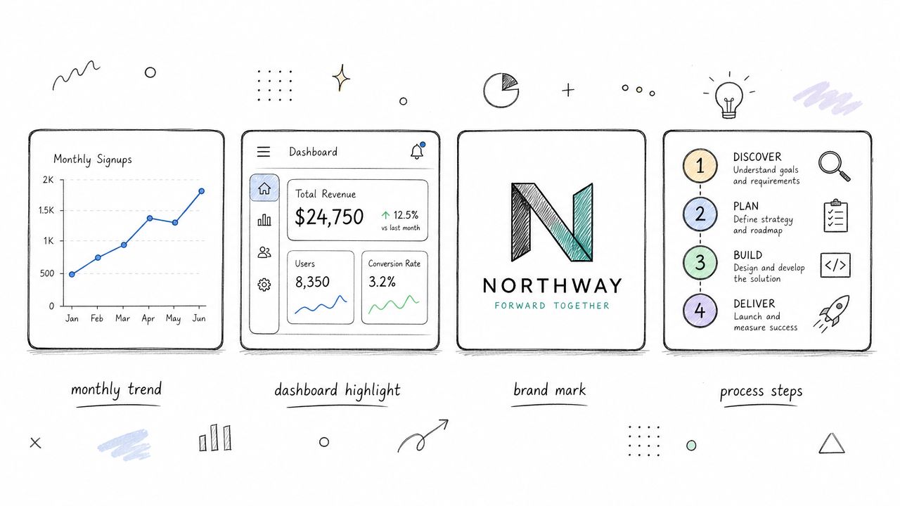
Match the format to the image type
Technical guidance from iubenda recommends staying under 125 characters, with an even tighter preference under 100 characters for clarity, and leading with the most important details first. That principle applies across image types, but the content changes by category.
Use patterns like these:
- For logos with functional purpose: Describe the brand or destination if the logo acts as a link.
- For decorative visuals: Use a null alt attribute so assistive tech skips it.
- For screenshots: Describe the product interface and highlighted task or result.
- For charts and graphs: Identify the chart type and summarize the main relationship.
- For images containing text: Repeat the visible text exactly.
That last rule is important. Level Access states that when an image contains text, the alt text should repeat that text verbatim. If the image is a promotional banner or a logo lockup with meaningful wording, paraphrasing can strip out the message.
There's also a hard line for decorative assets. Section 508 guidance, summarized by Moz, reinforces using an empty alt attribute for decorative images so screen readers ignore them entirely. That includes flourishes, separators, and purely visual accents.
A significant payoff of format-based rules is consistency. Once your team knows how to handle each category, alt text stops being an afterthought and becomes a repeatable publishing standard.
Alt Text: 8-Point Best Practices Comparison
| Guideline | Complexity 🔄 | Resource requirements ⚡ | Expected outcomes 📊 | Ideal use cases 💡 | Key advantages ⭐ |
|---|---|---|---|---|---|
| Be Descriptive and Specific | Medium, requires editorial judgment and context | Moderate, time per image, editing | High, improved accessibility, SEO, AI indexing | Dashboards, infographics, product images needing detail | Improves discoverability and accessibility; richer AI citations |
| Keep It Concise (Under 125 Characters) | Low–Medium, tight editing and prioritization | Low, character tools and quick reviews | Moderate–High, full screen‑reader reads; faster processing | Thumbnails, UI screenshots, simple illustrations | Ensures completeness for assistive tech; consistent, scannable alt text |
| Avoid Redundancy and "Image of" Phrases | Low, simple rule, behavioral change | Low, style guide updates and training | Moderate, more useful character budget and clarity | All image types; teams fixing legacy content | Aligns with WCAG; frees space for meaningful description |
| Optimize for SEO and AI Discoverability (Avoid Keyword Stuffing) | High, balances SEO, clarity, and evolving standards | Moderate–High, SEO expertise, audits, tracking | High, better search & AI visibility, citation potential | Marketing assets, featured images, research visuals | Boosts AI/search rankings while keeping accessibility intact |
| Consider Context and Page Purpose | High, requires page‑level strategy and intent analysis | Moderate, time to read surrounding content and adjust | High, improved relevance and AI interpretation | Case studies, product pages, blog posts | Connects images to narrative; improves topical signals |
| For Complex Images, Provide Extended Descriptions | High, extra content and design/markup choices | High, write long descriptions, link pages or captions | High, full accessibility and detailed indexing by AI | Detailed charts, dashboards, multi‑part infographics | Conveys complex data accurately; aids AI citation and accessibility |
| Test and Audit Your Alt Text Regularly | Medium, recurring process with manual checks | Moderate, tools (Lighthouse, Axe), staff time, audits | High, consistency, compliance, measurable improvement | Agencies managing many client sites and assets | Detects gaps, enforces standards, and drives continuous improvement |
| Format Alt Text for Different Image Types | Medium, create templates and type‑specific rules | Moderate, documentation, training, templates | High, consistent quality and correct interpretation | Mixed content sites: charts, logos, screenshots, infographics | Standardizes approach for faster creation and better AI understanding |
Make Every Image Count
Alt text belongs in the core content workflow. It's not the final box someone checks before hitting publish. When teams treat it that way, quality drops fast. They write vague labels, duplicate the same phrasing across unrelated pages, and leave complex visuals unexplained.
The better approach is simple. Treat alt text as part of how a page communicates meaning. That mindset improves accessibility first, which is a fundamental requirement. It also makes your content easier for search engines and AI systems to interpret because the page sends clearer signals about what each visual element contributes.
The legal and operational reasons are already strong. As noted earlier, accessibility errors remain widespread, and missing alt text is one of the most common failures. That should be enough to justify stronger process. But there's also a strategic upside. Teams that write better alt text usually end up improving surrounding content quality too. They clarify captions, tighten visual hierarchy, and explain charts more clearly. The page becomes better for everyone, not only for users of assistive technology.
For agencies, this is also a service-quality issue. If you manage multiple clients, alt text standards give you a repeatable way to improve publishing discipline across accounts. You can bake character limits into QA, define image-type rules in your style guide, require context-aware descriptions, and audit priority templates on a schedule. That turns accessibility from reactive cleanup into a visible part of delivery quality.
For in-house teams, the same principles apply. Start with high-value assets. Homepages, product pages, key category pages, cornerstone blog posts, and any page with charts or screenshots deserve review first. From there, fix your templates and your workflow so new content doesn't reintroduce the same problems.
One more principle should stay central as AI tools become more common. Use automation to speed up the first draft if you need it. Don't hand over judgment. As noted earlier, expert guidance warns against relying solely on AI for alt text because current tools still miss context and precision. Human review is what turns a baseline description into a useful one.
If you want your images to work harder, start with the basics and do them well. Write what matters. Keep it concise. Respect context. Skip decorative noise. Give complex visuals proper support. Then audit the result the same way you'd audit any other important search and accessibility signal.
Surnex helps agencies, in-house teams, and developers see how brands surface across AI search and traditional search in one place. If you're tightening image strategy, auditing content quality, and trying to understand how your pages appear in AI-driven discovery, Surnex gives you the visibility layer to track performance, spot gaps, and turn modern search changes into a repeatable workflow.