
Monday morning hits, and the report isn't ready yet. Six tabs are open, one export is stale, another client's numbers don't match because someone changed the date range, and the question on Slack is always the same, why did traffic drop. If you've ever spent the first hour of the week copying metrics instead of explaining them, the problem isn't your team's effort, it's the reporting pipeline.
Automate SEO reporting only works when you stop treating reports like files and start treating them like outputs from a data system. SEO reporting grew from simple rankings into a multi-source discipline, because modern reports now have to combine rankings, impressions, clicks, organic sessions, backlinks, and technical health in one recurring view, with Google Search Console and GA4 as the core systems of record TapClicks, TapClicks. That change is why automation stopped being a convenience feature and became an operational requirement.
Why Manual SEO Reporting Breaks at Scale
Manual reporting breaks in predictable ways. The first break is consistency, because one analyst calls something “organic traffic,” another calls it “non-paid sessions,” and a third pulls a slightly different range from a different interface. The second break is scale, because recurring weekly and monthly deliverables multiply fast across client accounts, and every extra account adds more exports, more QA, and more chances for a wrong chart to slip through.
The bigger issue is that manual reports usually mix source-of-truth metrics with proxy metrics without saying so. GSC clicks, impressions, CTR, and average position belong in one bucket, while GA4 sessions, users, engagement, and conversions belong in another. If the report doesn't make that distinction, stakeholders end up arguing about a chart instead of making a decision.
AI search visibility adds another layer of drift. Google AI Overviews, ChatGPT-driven discovery, and LLM citations do not sit cleanly inside a legacy SEO deck, so teams that only track rankings and sessions miss the first signs that visibility is shifting. The report needs room for that layer, but it also needs a human read on whether the mention, citation, or answer surface changes demand.
A useful internal reference is branded SEO reporting, because brand demand often masks what is happening in acquisition and AI-assisted discovery. Without that separation, a report can look healthy while the underlying search mix is changing in ways the team never sees.
Pick fewer metrics and assign each one a job
A clean report usually starts with 5 to 8 core indicators, not 20. That is not a design preference, it is a control mechanism. Fewer metrics make it easier to validate the data, spot anomalies, and keep the story focused on what changed.
A practical agency-side set looks like this:
- Organic sessions, because leadership cares about traffic flow from search.
- Non-brand clicks, because branded demand can hide weak acquisition.
- Indexed pages, because coverage problems change how much content can even compete.
- Core Web Vitals pass rate, because technical health affects user experience and crawl confidence.
- Referring domains, because link growth still matters as a supporting signal.
- Goal completions, because traffic without conversion isn't SEO value.
Practical rule: if a metric can't be tied to one clear owner and one clear decision, it doesn't belong in the recurring report.
Before automation starts, audit the current report line by line. Every metric needs a justification, a source of truth, or a kill date. If it has none of those, it is usually there because someone once asked for it, not because it still helps the business.
What to remove before you automate
The hardest part is not building the dashboard, it is deleting the noise. Remove duplicate charts, remove vanity totals with no comparison window, and remove anything that can't survive a monthly QA check. That cleanup does more for trust than another polished chart ever will.
A report becomes useful when the team can answer three questions from it without opening another tab. What changed? Why did it change? What should happen next? If a recurring report can't support those questions, it is a document, not an operating tool.
Designing a Reusable Report Template
A reusable template keeps the narrative from drifting every time the numbers update. It also makes review faster, because the reader knows exactly where to look for the summary, the anomaly callouts, the KPI block, and the next steps. In practice, that structure is what lets a strategist spend 15 to 30 minutes per client on interpretation instead of rebuilding the whole story from scratch RankYAK, RankYAK.
Build the template in blocks, not pages
Start with a header that identifies the account, the date window, and the audience. Then add an executive summary written by a human, because that's where the judgment lives. After that, place the KPI block, the anomaly callouts, the traffic and rankings section, the technical and backlink section, and a final actions block that turns the numbers into work.
A good template separates what the system generates from what a strategist writes. The data pull, metric tables, and chart refreshes can be automated. The what changed and why paragraph, the confidence note, and the next-step recommendation should stay human-authored, because those pieces need context that raw data doesn't have.
Use comparison windows carefully. A simple prior-period view is usually enough for weekly reports, while monthly reports can carry more context if the account is stable. Too many comparison modes create clutter, and clutter slows down the one person the report is supposed to help.
The internal planning detail matters here too. The template should be reusable enough that a client overlay is just a config change, not a redesign. That's why a branded reporting system with modular sections is much easier to scale than a deck that gets rebuilt from zero every month. A useful example of adjacent workflow thinking is the internal resource on branded SEO reporting.
A template only works if it can survive a bad week. If the traffic line dips and the crawl data lags, the structure still needs to make sense.
Add sparklines where the reader needs trend direction fast, use tables where exact values matter, and keep the visuals consistent across clients. A report that looks different every month feels bespoke, but it's harder to trust and slower to review.
Connecting Your Data Sources the Right Way
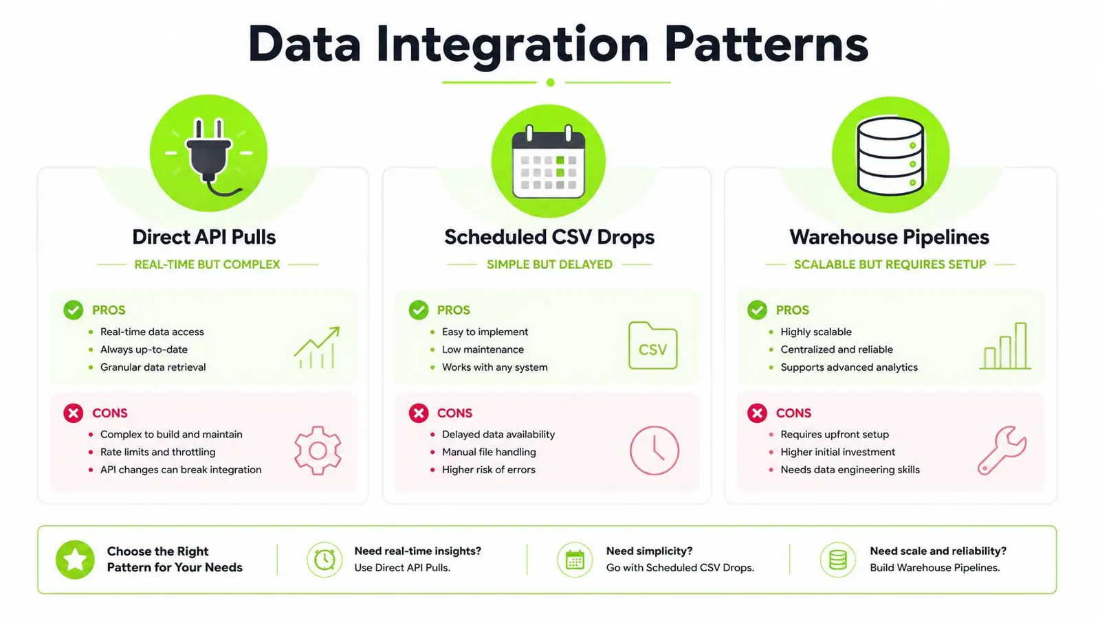
Most homegrown reporting setups fail at the integration layer, not the visualization layer. The choice is between direct API pulls, scheduled CSV drops, and warehouse-backed pipelines, and each one has a different pain point. API pulls are flexible but demand more engineering discipline, CSV drops are quick to stand up but can become brittle, and warehouse pipelines scale well once the setup work is done.
The foundation should stay boring. Google Search Console and GA4 are the primary sources of truth, while rank trackers, backlink databases, page-speed tools, and audit feeds should support the story rather than replace it. That keeps the report aligned with the metrics that move decisions.
The most common technical mistake is authentication drift. Personal logins expire, permissions change, and the report fails until someone notices a flatline. Service accounts reduce that risk, and staging the data before it reaches the client-facing template protects the report from a bad pull, a broken formula, or a malformed refresh.
Query the right dimensions and keep long-tail data intact
For GSC extraction, practitioner guidance consistently points to Date, Query, and Page as the dimensions that matter most. Row limits matter too, because if the pull truncates long-tail data, the report can misread performance and hide query-level movement that matters.
That's why a sane pipeline usually looks like this, pull the raw data on a schedule, store it in a sheet or warehouse, then render the report from a fixed template. The template stays stable even when the source tools change, which is exactly what you want when a client asks for a year-over-year comparison three days before the review call.
A useful internal reference for building the pipeline layer is the guide on data pipeline automation. Keep that separate from the report narrative. The pipeline moves data, the report explains it.
Operational habit: validate the raw pull before you validate the chart. If the input is wrong, a beautiful dashboard just makes the mistake harder to spot.
If your stack is still small, a structured spreadsheet plus a few APIs can be enough. Once account count rises and the QA burden gets real, warehouse-backed workflows become easier to govern than a collection of disconnected exports.
Scheduling, Delivery, and Alerting That People Trust
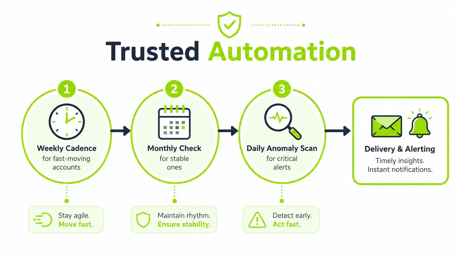
Timing carries as much weight as data quality. A report that arrives late, or arrives with the wrong date range, loses credibility quickly even when the numbers are correct. Weekly generation fits faster-moving accounts, monthly reporting works better for steadier ones, and daily jobs belong in anomaly detection rather than client-facing summaries.
Build the cadence around platform lag, not convenience
A practical weekly workflow delivers a Monday 8 a.m. report covering the prior 7 days, with the extraction window delayed enough to account for Google Search Console's 24-to-48-hour processing lag Vibe Marketing. That buffer avoids the common error of treating incomplete data as a real trend.
Use alerting for exceptions, not for every fluctuation. A traffic drop above 15% deserves manual review before delivery, and crawl-error spikes or sudden indexation loss should route to a human before the report goes out Vibe Marketing. That is quality control, not paranoia.
Delivery should fit the audience. Email works for executives who want a recurring readout, a client portal works for teams that need history, a dashboard works for operators who live in the data, and Slack works for quick exception routing. Do not choose the channel because the engineer prefers it, choose it because the stakeholder will use it.
The old pattern of “generate, send, hope” is what kills trust. A better pattern is “generate, validate, alert if needed, then deliver.” That sequence keeps noisy automation from turning into a reputation problem.
For teams comparing alerting systems and monitoring loops, the internal piece on automated SEO monitoring is a useful companion. If the report also needs to carry AI-search visibility, the same delivery discipline matters there too, because custom dashboard metrics for GEO only help when the underlying cadence is stable and the alerting logic is worth trusting.
Adding AI Search Visibility to the Same Report
Classic SEO reporting misses a growing part of search behavior if it stops at rankings and organic traffic. Google's AI-generated answers are changing what users see before they click, and reporting needs to reflect that shift instead of pretending the old funnel is unchanged. Independent analysis found that AI Overviews appeared in 18.76% of queries in March 2025, up from 6.49% in January 2025 SEOptimer, and Reuters reported that Google's AI Overviews and AI Mode can reduce referrals to publishers.
That doesn't mean building a second report. It means adding a new layer to the same report.
Add AI visibility as a first-class KPI set
The new fields are different from classic SEO metrics. Track citation coverage, prompt-level visibility, brand mentions inside AI answers, and appearance in AI Overviews alongside the existing GSC and GA4 sections. A unified dashboard makes the shift visible without forcing the team to compare two separate systems.
A platform like custom dashboard metrics for GEO is useful here because the reporting logic needs to accommodate AI visibility signals without discarding the classic ones. That's the practical challenge, not just gathering another number, but fitting the number into an operating rhythm the team already trusts.
The same Monday cadence still works. Keep the GSC lag in mind, scan for exceptions above your alert threshold, and route anomalies to a human before the report is distributed. If AI visibility is falling while clicks hold steady, that's a different story from a traffic drop caused by indexing delay, and the report needs to reflect that distinction.
For teams that need a dedicated AI visibility layer, the internal tracker on AI Overview monitoring fits cleanly into the same workflow.
Keeping the Human Layer in the Loop
Automation should remove repetitive work, not strategic judgment. The cleanest reporting systems I've seen don't try to automate the final explanation, they reserve it for a person who knows the account, the content calendar, the technical backlog, and the client's business model. That's the difference between a dashboard and a report people trust.
The human layer doesn't need much time, but it does need protection. A deliberate 15 to 30 minutes per client for narrative interpretation, anomaly investigation, and next-step recommendations is enough when the pipeline is healthy RankYAK, RankYAK. That window is where the actual product gets made.
What the human layer produces
A useful review should create three things, a short paragraph on what changed and why, a confidence note on the data quality, and a prioritized action list. Those outputs are what clients remember, because they turn metrics into decisions.
The failure modes are usually boring and expensive. A sudden flatline often means a stale service-account token. A phantom week-over-week drop often comes from misaligned date ranges in the GSC query. A report that looks fine but returns zero rows can be the result of a quota issue or a filter change that nobody noticed until after delivery.
Mixing proxy metrics with source-of-truth metrics causes another kind of failure. If a report puts a domain authority trend next to GSC clicks without labeling the difference, the client can't tell whether a change reflects search behavior, backlink growth, or just a tool-specific estimate. That's how confidence erodes even when the numbers themselves are accurate.
The cleanest dashboard in the world can still lie by omission if nobody explains seasonality, content launches, or indexing delays.
A human-in-the-loop model matters more than a fully automated one. A useful background read on that operating model is the human in the loop AI guide, because the underlying principle is the same, automation handles repetition, people handle judgment.
Run a short pre-flight check before delivery
A five-minute QA routine catches most bad sends. Check the date range, verify the source count, compare the main trend line to the previous period, confirm the anomaly flags were reviewed, and make sure the narrative matches the chart. If one part feels off, hold the report and fix the input.
The goal isn't perfection. The goal is a report that stays stable enough for automation, but still leaves room for a strategist to explain the business story. That balance is what keeps automation from turning into an automated illusion.
Scaling Multi-Client Reporting Without Losing Your Mind
Once the pipeline works for one account, the next challenge is governance. A single master template can cover most of the reporting structure, while client-specific overlays handle brand voice, KPIs, and delivery preferences. That approach keeps onboarding fast without forcing every account into the same exact story.
Access control matters more as the account count rises. Use service accounts, role-based dashboard access, and audit logs so the team can see who changed what and when. If a report breaks, you want a traceable path from the source pull to the final delivery, not a guessing game in Slack.
Rollout should look like a project, not a wish
A sane sequence is simple. First, audit the KPIs and design the template. Then connect the APIs and choose whether the data lives in a warehouse or a structured sheet. After that, pilot one client, add alerting and QA, then layer in AI visibility and roll the system across the remaining accounts with governance docs.
That kind of rollout also answers the warehouse question. If your team only needs a stable recurring report and a few integrations, a well-structured spreadsheet and a handful of APIs can be enough. If you need multi-client history, more complex joins, or stronger access controls, then BigQuery or Snowflake starts to make sense.
The point is not to over-engineer before the process proves itself. Teams often buy infrastructure before they've nailed the KPI map, and then spend months cleaning up a system that was wrong at the design level. It's cheaper to define the report's purpose first and the stack second.
For teams looking at ops automation patterns beyond SEO alone, AI tool examples for ops teams is a useful way to think about how reporting workflows can be structured without turning every task into a custom build.
A new client should be onboarded from config, not from scratch. If the template, source mapping, and delivery rules are reusable, a new account becomes a setup task instead of a new project.
Surnex gives teams a single place to track AI visibility and classic SEO signals together, so reporting doesn't split into separate systems as search changes. If you're rebuilding reporting for agencies or in-house SEO, visit Surnex and see how a unified workflow can support the dashboards, alerts, and AI search tracking your team already needs.