
You've got a dashboard that says the site is fast, the PageSpeed score looks decent, and the product team still wonders why checkout feels sticky. That gap is where most performance work goes off the rails. Site performance metrics only help when they're grouped by purpose, read in context, and tied back to what users do.
Google's tooling is built around measurable signals, not vibes, and that distinction matters. Google PageSpeed Insights uses both lab data and field data to evaluate loading, interactivity, and visual stability, which is why performance needs to be tracked as a set of outcomes, not a single score (Google's PageSpeed Insights documentation). Teams that manage sites at scale usually track page load time, server response time, error rate, cache hit rate, conversion rate, and related KPIs because those numbers tell different parts of the story.
A site can be technically quick and still fail at the business level. It can also be slightly slower but convert better because the interface feels stable, the page flow makes sense, and the user doesn't get blocked by broken interactions. That's the hard part of measuring performance well, and it's where careful interpretation beats raw speed chasing.
Why Fast Sites Still Fail at Conversions
A common audit pattern starts with a site that scores well in synthetic tests. The homepage loads quickly, product images appear without obvious lag, and the performance report shows mostly green. Then you open analytics, and the picture changes, visitors bounce, scroll shallowly, and few of them make it to the form or cart.
Speed is only one layer of the experience
That mismatch happens because technical speed is not the same thing as user behavior. A page can render quickly and still feel awkward if the primary button shifts, the menu delays, or the content hierarchy makes people work too hard to decide what to do next.
The useful way to think about site performance metrics is in three layers. Technical performance tells you how the page loads and responds. Engagement tells you whether people interact with it. Business outcomes tell you whether those interactions create value.
Practical rule: Never celebrate a faster page load until you've checked whether the page also holds attention and supports conversion.
Why one score leads to bad decisions
When teams collapse all of that into one headline number, they usually optimize the wrong thing. Developers may spend time shaving milliseconds off a resource that users never notice, while the issue sits in a broken CTA, a distracting layout shift, or a form that discourages completion.
The gap between technical and business performance is exactly why measurement frameworks recommend prioritizing by purpose. A media publisher cares about reading depth and ad stability. A SaaS team needs signups and activation. An e-commerce team needs product discovery, checkout completion, and trust signals, not just a prettier speed score.
The other mistake is treating a higher performance score as proof of better business results. That assumption breaks quickly in practice, because people don't buy or sign up just because a page loaded a bit faster. They convert when the page is usable, credible, and easy to move through.
A simple way to read the problem
Use the three layers as a diagnostic sequence. If technical metrics are poor, fix the foundation first. If technical metrics are fine but engagement is weak, the issue is probably layout, copy, navigation, or relevance. If engagement is healthy but conversions lag, the friction is likely in the offer, form, pricing, or checkout path.
That structure keeps teams from overreacting to one metric family and ignoring the others. It also makes reporting clearer, because a load-time win, a UX win, and a revenue win are related, but they're not the same achievement.
Core Web Vitals Explained with Real Examples
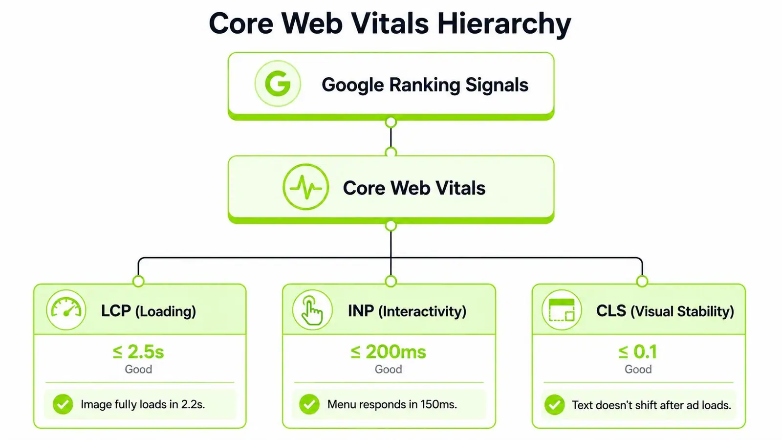
Google's current user-centric framework centers on Largest Contentful Paint (LCP), Interaction to Next Paint (INP), and Cumulative Layout Shift (CLS). Google also treats FCP and TTFB as supporting metrics, but Core Web Vitals have become the shared language for real-user quality, as described in web.dev user-centric performance metrics. That matters because browser timing data now lines up much more closely with what people experience on the page.
Largest Contentful Paint measures perceived loading
LCP is the point when the main content in the viewport becomes visible. On a product page, that is often the hero image or the main headline block. On a content page, it may be the feature image or title area.
Poor LCP usually points to slow servers, heavy images, render-blocking CSS, or late-loading hero assets. Good LCP means the user can see the page's main purpose quickly, not just a shell or spinner. If the page feels blank for too long, people often leave before they read anything.
Interaction to Next Paint measures responsiveness
INP measures how quickly the page responds when someone clicks, taps, or types. Google's current guidance centers INP as part of the modern Core Web Vitals set, and practitioners now treat it as one of the main metrics to watch alongside LCP and CLS. In practical terms, INP shows whether the page feels alive when the user tries to do something.
That is a meaningful shift from older thinking around First Input Delay. If a menu opens late, a filter freezes, or a cart drawer hesitates after a tap, the user experiences friction even if the page looked fast on first render. For a closer comparison of the older interaction metric, Otter A/B on FID is a useful companion read.
Cumulative Layout Shift measures visual stability
CLS tracks unexpected movement in the layout. If a cookie banner loads and pushes content down, or an ad slot appears and shifts the article text, the page feels unstable. Users dislike that because it breaks reading flow and can cause misclicks.
Good CLS means the page stays visually predictable while it loads. Poor CLS usually comes from images without reserved dimensions, injected ads, late-loading fonts, or interface components that appear after the page is already visible.
If you want a practical place to start, use Surnex's web vitals tool to spot which of the three metrics is dragging the page down first. The key is not to chase all three blindly. Each one points to a different class of problem, and fixing the wrong one can leave the user experience unchanged.
Real-world shortcut: If the page looks fast but feels awkward, check INP. If it looks broken while loading, check CLS. If the main content appears late, check LCP.
Technical Performance vs Engagement vs Business Metrics
A good measurement stack separates three families of site performance metrics instead of forcing them into one report. Technical metrics tell you how the system behaves. Engagement metrics tell you how people react. Business metrics tell you whether the site is doing its job.
| Metric Category | Examples | What It Measures | Primary Tools |
|---|---|---|---|
| Technical Performance | TTFB, page load time, server response time, error rate, cache hit rate | Delivery health, rendering speed, and infrastructure behavior | PageSpeed Insights, Lighthouse, server logs, monitoring suites |
| Engagement | Bounce rate, time on page, pages per session, scroll depth | Whether visitors stay, read, and move deeper into the site | Analytics platforms, tag managers, heatmaps |
| Business Outcome | Conversion rate, revenue per visitor, goal completion rate | Whether the site creates leads, sales, or other outcomes | Analytics, CRM reports, ecommerce dashboards |
The families interact, but they are not interchangeable
A technically fast site can still underperform if the page doesn't answer the visitor's question or guide the next step. A site with strong engagement can still miss revenue goals if the conversion path is confusing or the offer is weak. A site with strong business results may tolerate a slightly weaker technical profile if the audience is highly motivated and the flow is clear.
That's why framework design matters. For a lead-generation site, conversion metrics usually deserve the most attention. For a publisher, engagement and ad-view stability may matter more. For a SaaS product, activation and task completion often matter more than generic traffic speed.
Decision rule: Start with the metric family that maps closest to revenue or user value, then use the other families to explain why that result is happening.
What to prioritize by site type
An e-commerce team should watch technical metrics that affect product discovery and checkout reliability, then connect them to cart completion and order flow. A content team should care more about reading continuity, scroll depth, and ad-induced instability. A SaaS team needs responsiveness, feature usage, and signup or activation completion. A local business site usually needs clear contact actions, map clicks, and appointment starts more than perfect lab scores.
The trap is over-reporting everything with equal weight. That creates dashboards that look complete but don't tell decision-makers what to fix first. The better approach is to give each metric family a job and make that job visible in the reporting layer.
How to Measure Performance Using Lab and Field Data
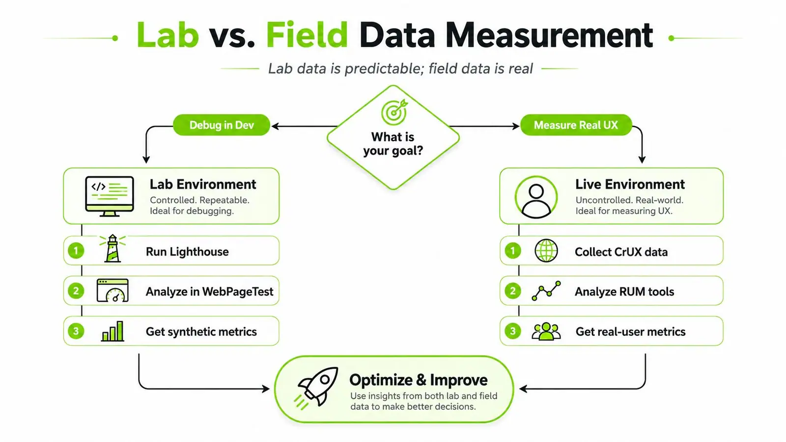
A fast score in a testing tool can still miss what users feel. Lab data and field data answer different questions, and they need to be read together if you want to separate technical problems from business impact.
Use lab data to isolate the cause
Google PageSpeed Insights and Lighthouse are useful when the goal is to reproduce a problem in a controlled environment. They show what is blocking rendering, what is delaying interactivity, and what is adding weight to the page. That makes them practical for development checks, pre-launch QA, and regression debugging.
Lab tests work best when the question is narrow. Is the hero image too heavy, is JavaScript blocking the main thread, or is a font loading too late? A repeatable test can answer those questions cleanly, which is exactly why technical teams still rely on it.
Use field data to understand the audience
Field data is more representative because it captures real devices, real geographies, and real connection quality. Google's guidance emphasizes using both lab data and Real User Monitoring, and current Core Web Vitals guidance points to a rolling aggregation approach, which is a useful reminder that one test run can mislead (web.dev user-centric performance metrics).
That matters because experience varies by segment. A synthetic run from one location can look fine while mobile users on slower networks struggle elsewhere. If a site serves multiple regions, measure by geography, device class, and page type, not just by homepage snapshots.
Build a measurement routine that matches the audience
Separate debugging from reporting. Use Lighthouse or similar lab tools to isolate issues, then report with CrUX-style field data and your own RUM setup. Segment the data so you can compare mobile and desktop, new visitors and returning visitors, and high-traffic templates against niche ones.
For teams that need to connect site metrics to broader reporting, Surnex's data analytics dashboard article is a useful reference for structuring metric views without hiding the source data.
The video below is also useful if your team wants a plain-English refresher on how these measurements fit together in practice.
Single tests are good for finding bugs. They're not good for defining user reality.
Realistic Performance Benchmarks by Industry and Site Type
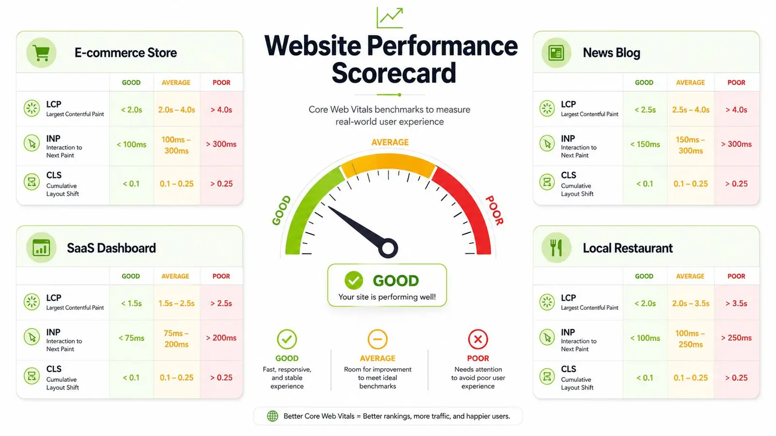
Benchmarking works best when you compare like with like. A large content site, a booking flow, a SaaS dashboard, and a local business page all serve different intent, so their site performance metrics should never be judged by the same blunt benchmark.
Set baselines against your own template mix
An e-commerce store usually has heavier images, more scripts, and more dynamic content than a local service site. A news blog may load faster on the homepage but become slower on article pages with ads and recommendation widgets. A SaaS dashboard often feels different again, because logged-in application behavior matters more than a simple landing page load.
That means the most useful benchmark is your own baseline, broken out by template and device. Use the homepage separately from product detail pages, article pages, pricing pages, and logged-in views. Otherwise, you end up comparing a lightweight landing page to a much heavier transactional screen and drawing the wrong conclusion.
Track movement, not just the snapshot
Seasonal changes can also distort the picture. Traffic composition shifts, ad stacks change, and feature rollouts can change the shape of the experience without warning. A monthly roll-up is usually more useful than a one-off snapshot because it shows whether a page type is improving or bouncing around.
The most honest way to track performance is to combine lab and field trends. Lab data tells you whether the code change was sensible. Field data tells you whether actual users benefited. If the two disagree, the page may be structurally better but still limited by geography, device mix, or third-party overhead.
For broader comparison work across segments, Surnex's industry benchmarking guide is a good companion when you need to explain why one site type can't be judged like another.
Benchmarking mistake to avoid: Don't set one universal target for every page. Set targets by template, device, and business role.
Troubleshooting Common Performance Problems
Most performance issues fall into a few familiar buckets. The fix is rarely mysterious, but teams often attack the symptom instead of the cause. That's how a quick-looking homepage still feels slow once the user tries to do anything useful.
Start with the bottleneck you can actually observe
If the problem looks like slow initial rendering, check server response time and TTFB first. If the problem is visible jank or a late response after interaction, focus on JavaScript, third-party scripts, and main-thread work. If the content jumps around, look at dimensions, ad slots, and late-loading assets.
Practical rule: Diagnose from the user's pain, not from the loudest metric in the dashboard.
Match the fix to the symptom
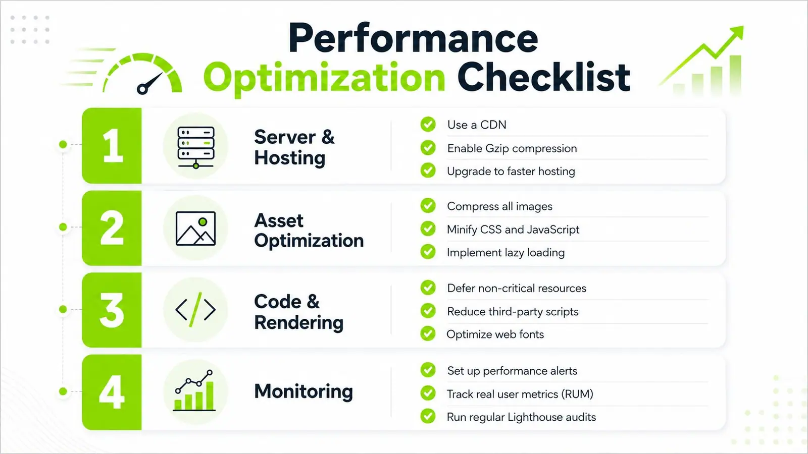
Slow server response usually needs infrastructure work, not front-end cosmetics. That can mean a CDN, better caching, database tuning, or less work on the origin. Large page size usually points to oversized images, uncompressed assets, or too much code being shipped before it's needed.
Render-blocking resources are a different class of problem. If CSS or JavaScript stops the browser from painting, defer what isn't essential and extract critical styles earlier in the load path. For CLS issues, reserve space for media, stabilise ads, and stop injecting layout-changing elements after the page is visible.
Watch out for the common mistakes
Teams often make performance worse while trying to improve it. They add too many third-party tags, load multiple analytics tools that overlap, or compress assets so aggressively that quality drops and the page still feels heavy. They also forget to test on real devices, which hides mobile pain behind desktop convenience.
A lot of teams also optimise one metric while harming another. For example, reducing a layout shift by delaying content can make the page feel less broken but slower to read. The fix is to test each change against both technical and user-facing metrics.
The checklist below gives a practical sequence for teams that want a repeatable cleanup plan rather than one-off heroics.
Integrating Performance Metrics into Agency and Engineering Workflows
Performance work starts to matter when it fits the team's operating rhythm. Weekly checks should focus on technical regressions and the templates that drive the most traffic or revenue. Monthly reviews should connect those shifts to engagement and business metrics. Quarterly reviews should test whether the measurement model still matches the site's goals and the way the business is being run.
Give each stakeholder a different view
Engineers need detail. They need waterfalls, long-task patterns, and template-level anomalies that point to where a release slowed the page. Clients and executives need a summary that shows how those changes affect user experience and business impact. One dashboard rarely serves both well, so build separate views from the same source data and keep the same definitions behind them.
Automation helps here because manual reporting does not scale across portfolios. Alerts for regressions, scheduled audits, and RUM summaries keep the team from finding problems after a campaign or release has already taken a hit. For a practical structure that agencies can use across accounts, Surnex's agency client reporting guide is worth using as a reporting reference.
Prioritize by impact and effort
A useful workflow is to score improvements by expected business impact and implementation effort. Fix the high-impact, low-effort items first, then plan the deeper engineering work. That keeps the team from spending a sprint on a marginal improvement while a checkout blocker stays live.
Metric families should also stay separate in the review process. Technical metrics tell you whether the page loads and responds cleanly. Engagement metrics show whether people stay, scroll, or interact. Business metrics show whether the visit turns into revenue, leads, or another outcome that matters to the site owner. A page can look better in a lab report and still underperform in the funnel, so tie each recommendation to the outcome it should move.
For teams that need to turn those findings into client-ready reporting, check Oviond's optimization guide alongside your internal workflow, then map each fix to the metric family it is meant to improve.
Surnex includes a Core Web Vitals Checker and can track Core Web Vitals alongside broader SEO data, which makes it one practical option for teams that want performance signals in the same place as other search and audit workflows. Use tools like that to keep the same priorities visible to engineering, SEO, and account teams, instead of letting each group report on a different version of performance.
The most durable teams do not chase every metric. They monitor the right ones, tie them to a business role, and review them on a cadence that matches how often the site changes. Start with the bottleneck you can observe, then confirm whether the fix improved technical performance, user engagement, or conversion behavior.