You're staring at a product page, a documentation article, or a filtered search result, and you can tell you're deep inside a website. The page works, the content is useful, but there's one nagging question: how do I get back without starting over? That's exactly where a bread crumbs menu earns its keep. It gives people a visible trail, helps them understand where they are, and gives search engines a cleaner picture of the site structure.
Why Every Complex Website Needs a Trail
A user lands on a laptop on a category page for running shoes. They click through a few filters, open a product, read the details, and then realize the item isn't quite right. Without a trail, their choices are the browser back button, the main menu, or a fresh search. With a breadcrumb trail, they can jump straight back to the category they came from and keep exploring.
That small difference matters because it lowers friction at the exact moment people feel stuck. Breadcrumbs don't replace a menu, they act like the hallway signs in a large building. They tell users, “You're here, and this is how you move up one level.”
For sites with layered content, the value is even clearer. Product catalogs, knowledge bases, university programs, and support portals all create deep hierarchies, and people get lost in them fast. In those cases, the breadcrumb trail becomes a wayfinding tool, not a decorative UI line.
If your site search is also carrying a lot of the navigation load, pairing it with a clean breadcrumb pattern is smart. A useful companion resource on that side is organizing digital experiences effectively, because information architecture and breadcrumbs usually solve the same user problem from different angles.
Practical rule: if a user can reasonably ask, “Where am I in this site?”, breadcrumbs probably belong there.
Understanding the Bread Crumb Menu
Think of Hansel and Gretel, but swap the forest for a website. The trail is there so you can trace your route back without guessing. A breadcrumb menu works the same way. It shows the user's position in the site hierarchy and gives them a quick way to move upward to a parent page.
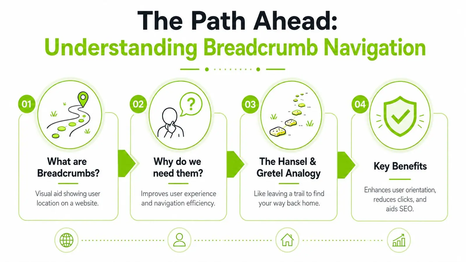
The most important thing to remember is that breadcrumbs are secondary navigation. They support the main menu, they don't compete with it. Google's structured-data guidance for a valid BreadcrumbList also requires at least two ListItem objects, which is a helpful reminder that breadcrumbs are a real hierarchy signal, not just a visual flourish. That's why systems like the Salt Design System breadcrumb pattern treat them as part of both interface design and machine-readable structure.
The three breadcrumb types
Location-based breadcrumbs show where the user sits in the site tree. A university might use this for a path like “Home > Academics > Engineering > Computer Science.” It's the classic choice for hierarchical sites.
Path-based breadcrumbs reflect the route a user took through the site. They're closer to a history trail than a category trail, so they fit unusual journeys, multi-step tools, and complex backtracking flows.
Attribute-based breadcrumbs show selected filters or product attributes. An ecommerce page might show something like “Shoes > Size 10 > Blue,” which helps people understand the current filter state at a glance.
That basic split matters because readers often assume all breadcrumbs behave the same way. They don't, and choosing the wrong type creates confusion instead of clarity.
The Dual Benefits for UX and SEO
A breadcrumb trail pays off in two directions at once. Users get orientation and a faster route back to higher-level pages. Search engines get a clearer signal about page relationships, which helps them read your architecture more cleanly.
UX value
From a user's point of view, breadcrumbs reduce the mental work of asking, “Where am I?” and “How do I get to the broader category?” They're especially helpful when a page is reached from search, social, or a deep internal link rather than from the homepage. In those moments, the breadcrumb trail reorients the visitor without forcing a reset.
This is also why breadcrumbs fit neatly into good information design. If you want a broader framing of that discipline, organizing digital experiences effectively is a helpful companion read. Breadcrumbs make the structure visible, while information architecture decides what the structure should be.
Breadcrumbs work best when the user's next move is likely to be “go up one level,” not “start over from scratch.”
SEO value
Search engines use breadcrumb markup as structural context. That doesn't mean breadcrumbs magically fix rankings, but it does mean they can support crawling, indexing, and rich result eligibility when implemented correctly. If you're sorting out the SERP side of the topic, the overview on what rich snippets are is a useful complement.
The key SEO point is simple. Breadcrumbs help connect the page to its parent categories and make site relationships easier to parse. In large sites, that clarity matters because internal linking and hierarchy both affect how search systems interpret relevance.
Choosing the Right Breadcrumb Type
Location-based breadcrumbs are a common default because they're familiar. That's fine for a lot of sites, but it isn't always the best fit. The better question is, “What problem is this site trying to solve for users?”
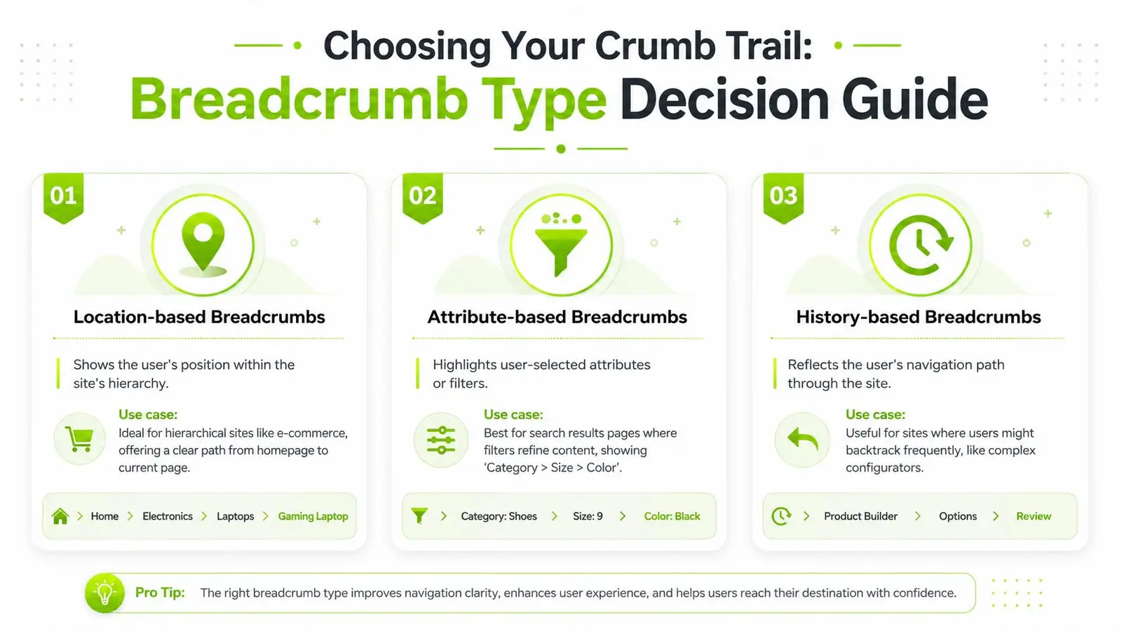
Location-based breadcrumbs
Use these when your site has a stable hierarchy. Ecommerce catalogs, blogs with nested categories, and documentation portals are the natural home for this pattern. It answers one question very well, “Where is this page in the site?”
A good test is whether two users landing on the same page should see the same trail. If the answer is yes, location-based breadcrumbs are usually the right choice.
Attribute-based breadcrumbs
Use these when the state of the page depends on selected filters or product attributes. Search results, faceted catalogs, and comparison pages are the main candidates. The breadcrumb trail then becomes a visible record of the current filters rather than a map of static categories.
This is the type people often misread as a category trail, which creates confusion. If the trail shows filters, the user should understand that removing one crumb changes the result set.
Path-based breadcrumbs
Use these when the route matters more than the hierarchy. Complex configurators, guided workflows, and backtracking-heavy tools may benefit here. The trail reflects what the user has done, not just where the page lives.
That's why design guidance treats breadcrumbs as a secondary aid, not a substitute for primary navigation. As noted in Nielsen Norman Group's breadcrumb guidance, the choice between location, path, and attribute breadcrumbs depends on architecture, and that choice matters even more on mobile where space is tight.
Decision shortcut: if users need orientation, choose location. If they need state awareness, choose attributes. If they need retracing, choose path.
Implementation and Design Best Practices
The cleanest breadcrumb trails are the ones people barely notice until they need them. That starts with placement. Put them near the top of the page, usually above the main heading, so users can orient themselves before reading the page body.

The HTML matters too. Use <nav> to expose the breadcrumb as navigation, then structure the items with <ol> so the trail reads as an ordered path. The current page should be plain text, not a link, because clicking the page you're already on adds no value and can feel broken.
A practical implementation pattern is to keep the separator visual, not structural. Typical separators include a chevron, a greater-than symbol, or a slash. The exact glyph matters less than consistency, spacing, and readability.
Mobile behavior
On small screens, breadcrumbs can become noisy fast. Guidance from building breadcrumb navigation for users points to three things that matter most, use semantic <nav> and <ol>, keep the current page unlinked, and avoid wrapping the trail to multiple lines on mobile. That last point is easy to ignore, but a wrapped breadcrumb often turns into clutter.
If the path is long, shorten it intelligently. Show fewer intermediate nodes, collapse lower-priority segments, or prioritize the first and last items. What you want is a trail that still tells the truth without stealing the whole header.
For layout decisions where breadcrumbs need to live alongside other modules, inline module design options is a relevant reference because placement can affect both scanability and page rhythm.
And if your site is a single-page app, breadcrumb rendering deserves the same care as routing and state updates. The overview on SEO in SPAs is useful because client-side navigation changes how URLs, hierarchy, and visible state stay in sync.
A simple checklist
- Put the trail near the top: users should see it before they start hunting for the back button.
- Keep the current page non-clickable: the active crumb is a label, not an action.
- Use ordered semantics:
<nav>and<ol>make the structure clearer to assistive tech. - Protect mobile readability: don't let the trail wrap into a stacked mess.
- Keep the labels descriptive: people should know where each click leads.
The best breadcrumb implementations feel obvious after the fact. That's because they follow the page structure instead of fighting it.
Adding Structured Data for Modern SEO
Breadcrumbs become more useful to search engines when they're marked up in structured data. The usual approach is Schema.org's BreadcrumbList, which gives crawlers a machine-readable version of the same hierarchy users see on screen. If you want modern search visibility, this isn't optional.
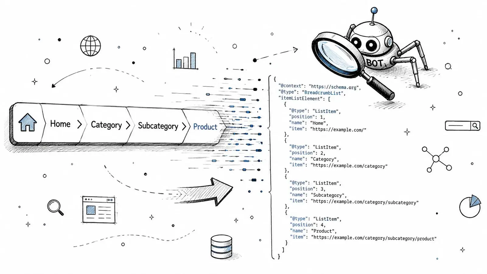
The SEO value in 2026 still hinges on structured data, even if direct ranking impact is debated. Proper schema remains important for rich snippet eligibility and for giving search systems clear context, especially as interfaces get more AI-driven, as noted in current breadcrumb SEO guidance. If you're auditing markup quality, structured data testing is the right companion topic.
JSON-LD example
Here's a straightforward pattern you can adapt:
<script type="application/ld+json">
{
  "@context": "https://schema.org",
  "@type": "BreadcrumbList",
  "itemListElement": [
    {
      "@type": "ListItem",
      "position": 1,
      "name": "Home",
      "item": "https://example.com/"
    },
    {
      "@type": "ListItem",
      "position": 2,
      "name": "Category",
      "item": "https://example.com/category/"
    },
    {
      "@type": "ListItem",
      "position": 3,
      "name": "Current Page"
    }
  ]
}
</script>
The first two items include real URLs because they're navigable parents. The current page is the terminal node, so it can remain unl inked in the schema as well as in the UI, depending on your implementation pattern. Keep the names aligned with the visible trail, because inconsistent labels create confusion for both users and crawlers.
For teams working on technical SEO and AI visibility, making businesses recommended in AI search is a relevant adjacent topic because structured signals are part of how modern systems interpret pages, entities, and relationships.
What to verify
- The item order matches the visible trail.
- Each parent page points to a real canonical URL.
- The schema mirrors the on-page breadcrumb text.
- The markup is present on template-generated pages, not just a few hand-picked URLs.
When the markup and the visible UI tell the same story, search engines get a much cleaner signal.
A Small Feature with a Big Impact
A bread crumbs menu looks minor until you remove it. Then users lose their bearings, category navigation gets harder, and the page stops explaining itself. That's why the trail matters. It turns a deep site into something legible.
The strongest breadcrumb setups do three things well. They orient users, they reinforce hierarchy, and they speak clearly to search engines. The right type depends on your site, though, so a product catalog, a knowledge base, and a configurator shouldn't all use the same pattern by default.
Structured data closes the loop. It turns a visible UI element into a machine-readable signal that supports modern search behavior and helps AI-driven systems understand page relationships more accurately. In a web that keeps moving toward richer search surfaces, clarity is a real advantage.
Build breadcrumbs like a navigation system, not a decorative line. If your site has depth, the trail belongs there.
A CTA for Surnex. If you're auditing how breadcrumbs, schema, and site structure show up in search and AI-driven discovery, Surnex can help you track visibility, spot gaps, and turn those signals into a clearer SEO strategy.